Introduction to DragTK
DragTK is a visual Python GUI builder. It lets you design app windows by adding visual components onto a canvas, then generates the Python code for you behind the scenes.
What is DragTK for?
Python is one of the most widely taught programming languages in schools — but it doesn't come with a visual design tool. If you've ever used Visual Basic or similar tools, you'll know how useful it is to be able to see your app taking shape as you build it.
DragTK fills that gap. You drag widgets (buttons, labels, text boxes and more) onto a canvas, arrange them how you want, and DragTK writes the Tkinter Python code automatically. You can then add your own logic in the code editor, and run the app directly from within DragTK.
Tkinter is Python's built-in library for building desktop applications with graphical interfaces. It comes included with Python — no extra installation needed.
What you'll need
Before you start, make sure you have the following installed on your computer:
If your school's IT policy doesn't allow running .exe files, you can download the raw .py source files from GitHub instead and run DragTK.py directly using Python.
How the lessons are structured
The Learn section is split into two parts:
Widget Reference — a lesson for each type of widget you can add to your app, covering how to place it in DragTK and how to work with it in code. Start with Button and Label if you're new, then work through the rest as you need them.
Example Projects — guided walkthroughs that build complete apps from start to finish, using multiple widgets together. These are a great next step once you're comfortable with the basics.
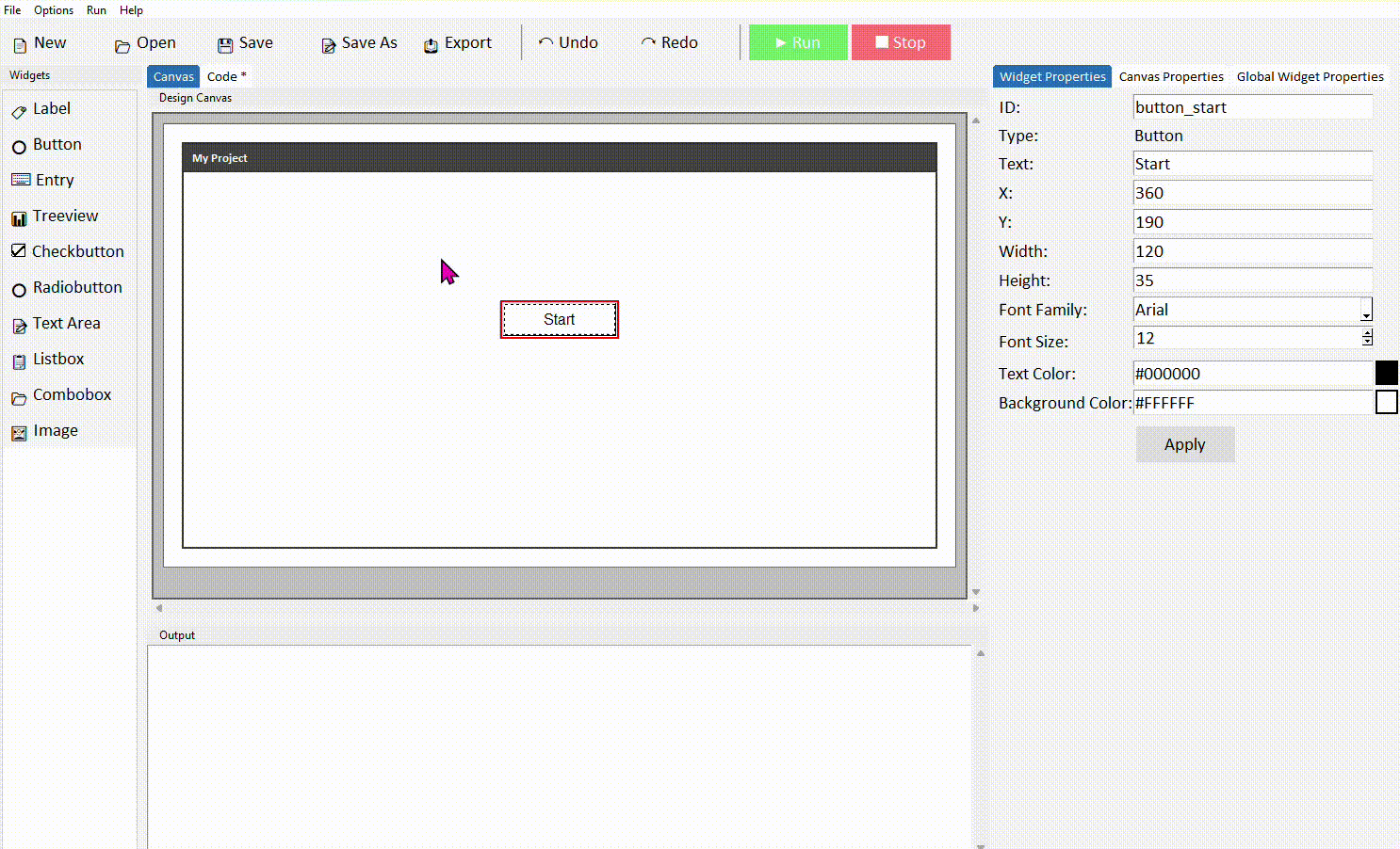
The Interface
A quick tour of the DragTK window so you know where everything is before you start building.
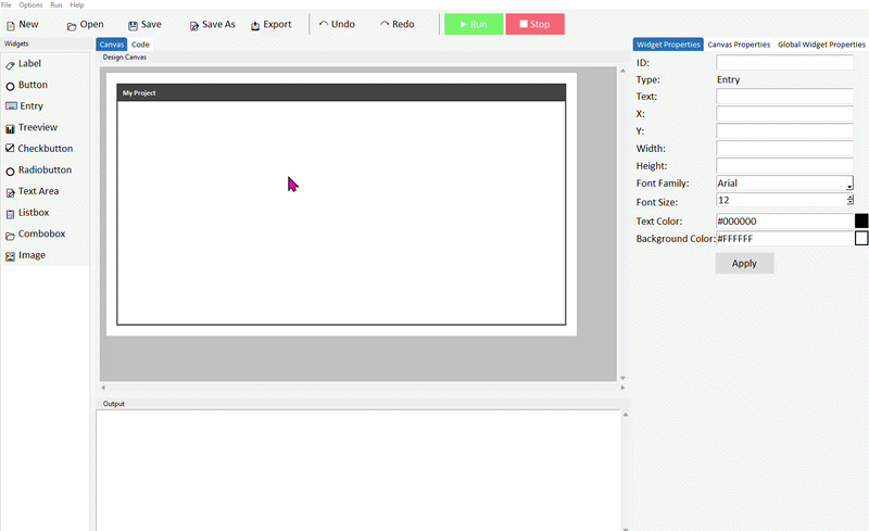
Overview
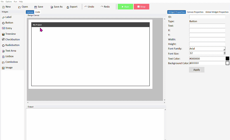
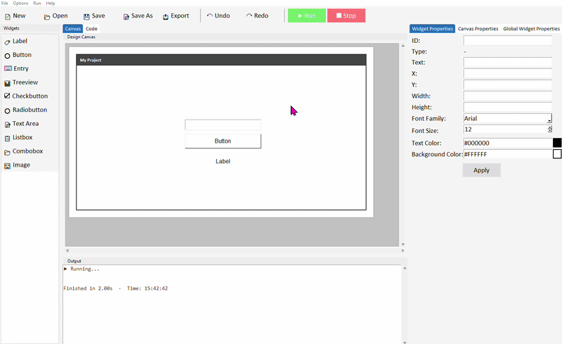
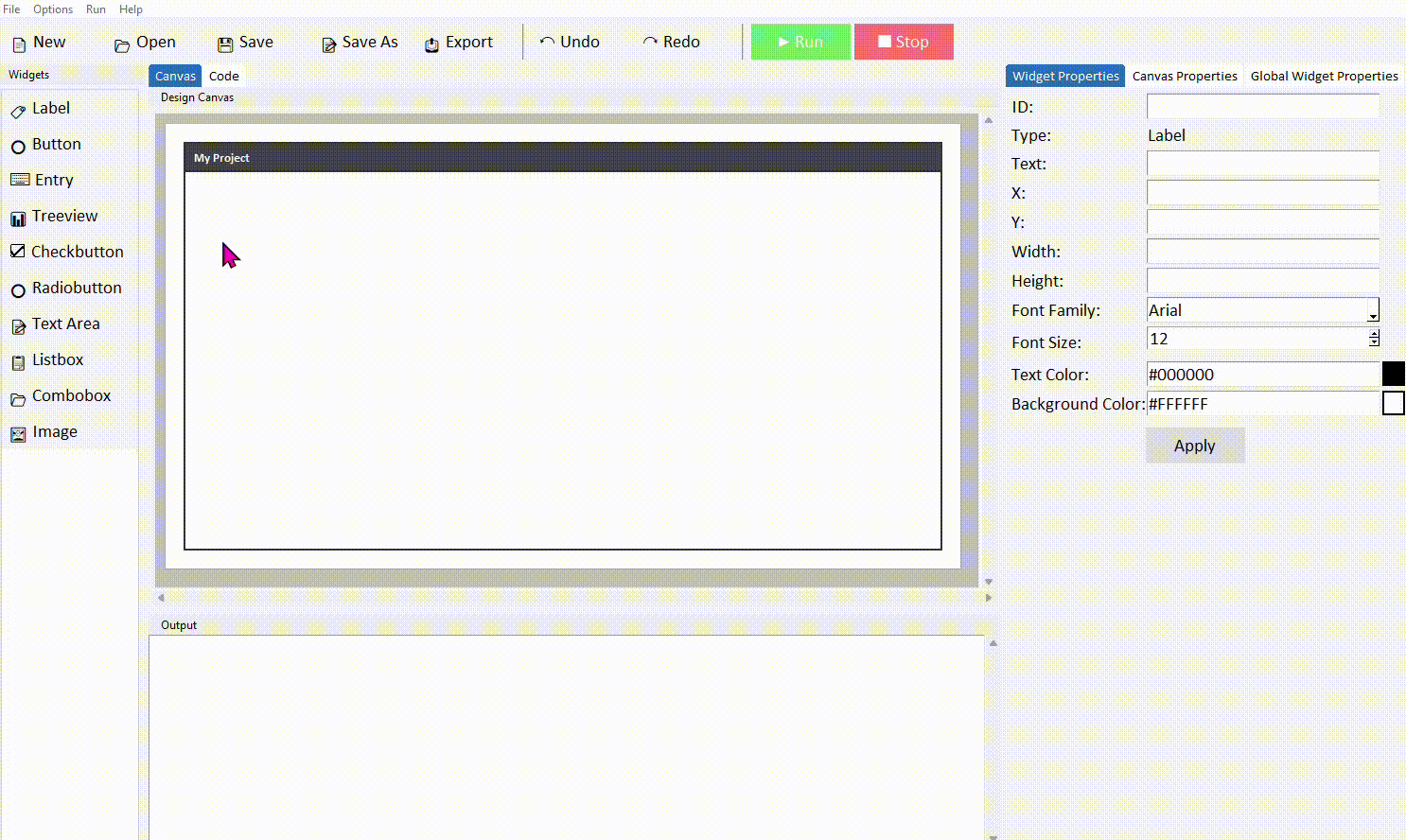
When you open DragTK, you'll see the main window divided into several areas. Here's what each one does:
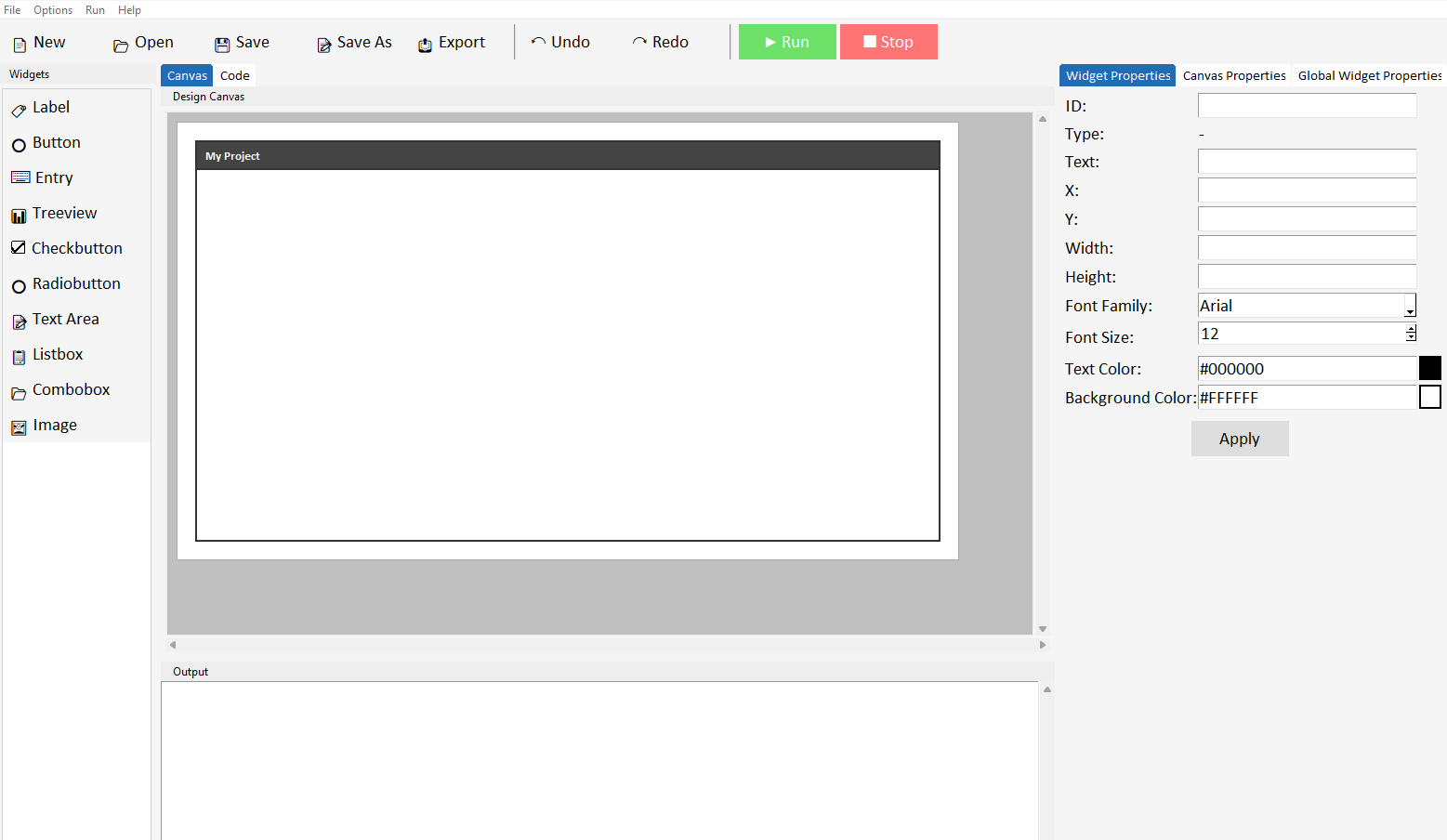
The Widget Panel
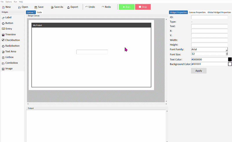
On the left side of the screen is the widget panel. This lists all the widgets you can add to your app — buttons, labels, entry fields, and more. Click any widget to add it to the canvas.
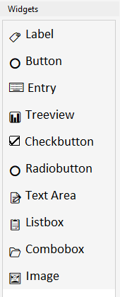
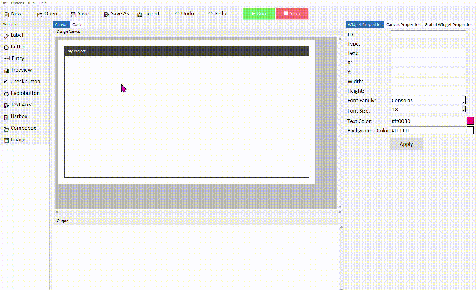
The Canvas
The large area in the centre of the screen is the canvas. This represents your app's window. Widgets you add appear here, and you can drag them around to position them wherever you want.
The canvas size represents the size of your app window. You can resize it by editing it's width and height in the canvas properties panel on the right, which will also resize the app when it runs.
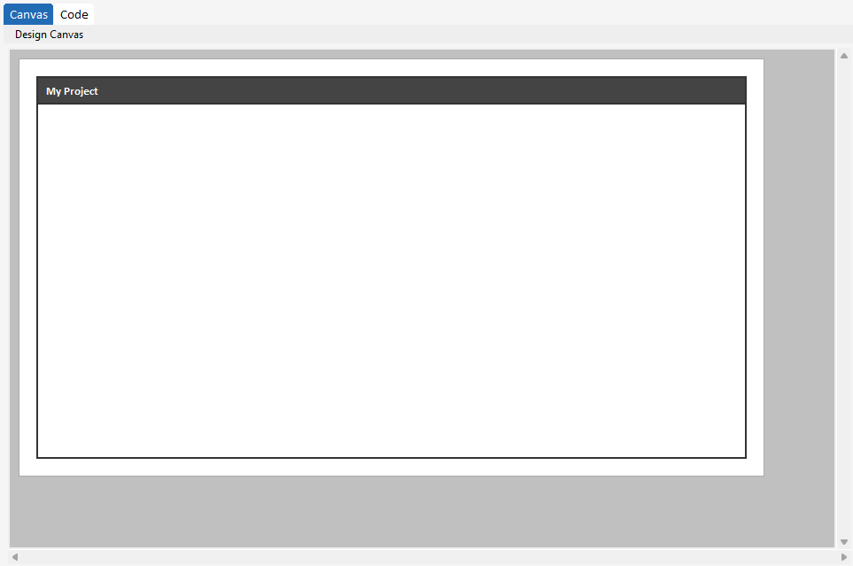
The Properties Panel
On the right side is the properties panel. Here, you can switch between the widget properties, canvas properties, and global widget properties tabs.
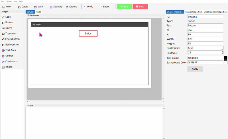
Widget Properties
When you click on a widget in the canvas, its properties appear here — things like text, font, colour, and size. Make your changes and click Apply to update the widget.
This is also where you set the widget's ID — the name used to reference it in your Python code. It's worth giving widgets meaningful names like button_submit or label_result rather than the default button1.
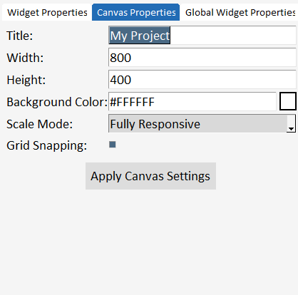
Canvas Properties
In the canvas properties tab, you can change certain settings relating to the canvas. The canvas represents your app window. You can change the title, width, height, background colour, and scale mode for your app. You can also toggle grid snapping on and off. By default, grid snapping is on and when on widgets on the canvas move by 10px to help you align your widgets more easily.
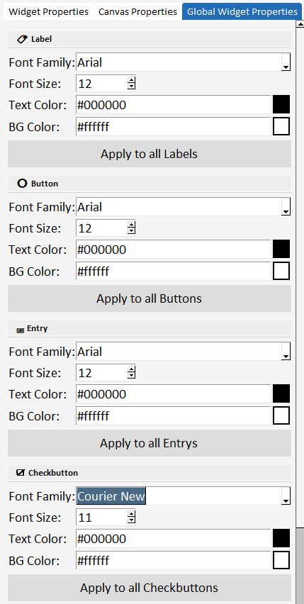
Global Widget Properties
The global widget properties panel lets you update the properties of all widgets of a specific type on your canvas. For example, if you have added 10 labels to your project, and decide later you want to change the font style of all labels - instead of manually selecting and changing the font style of each label, you can use global properties to update the font style of all labels at once.
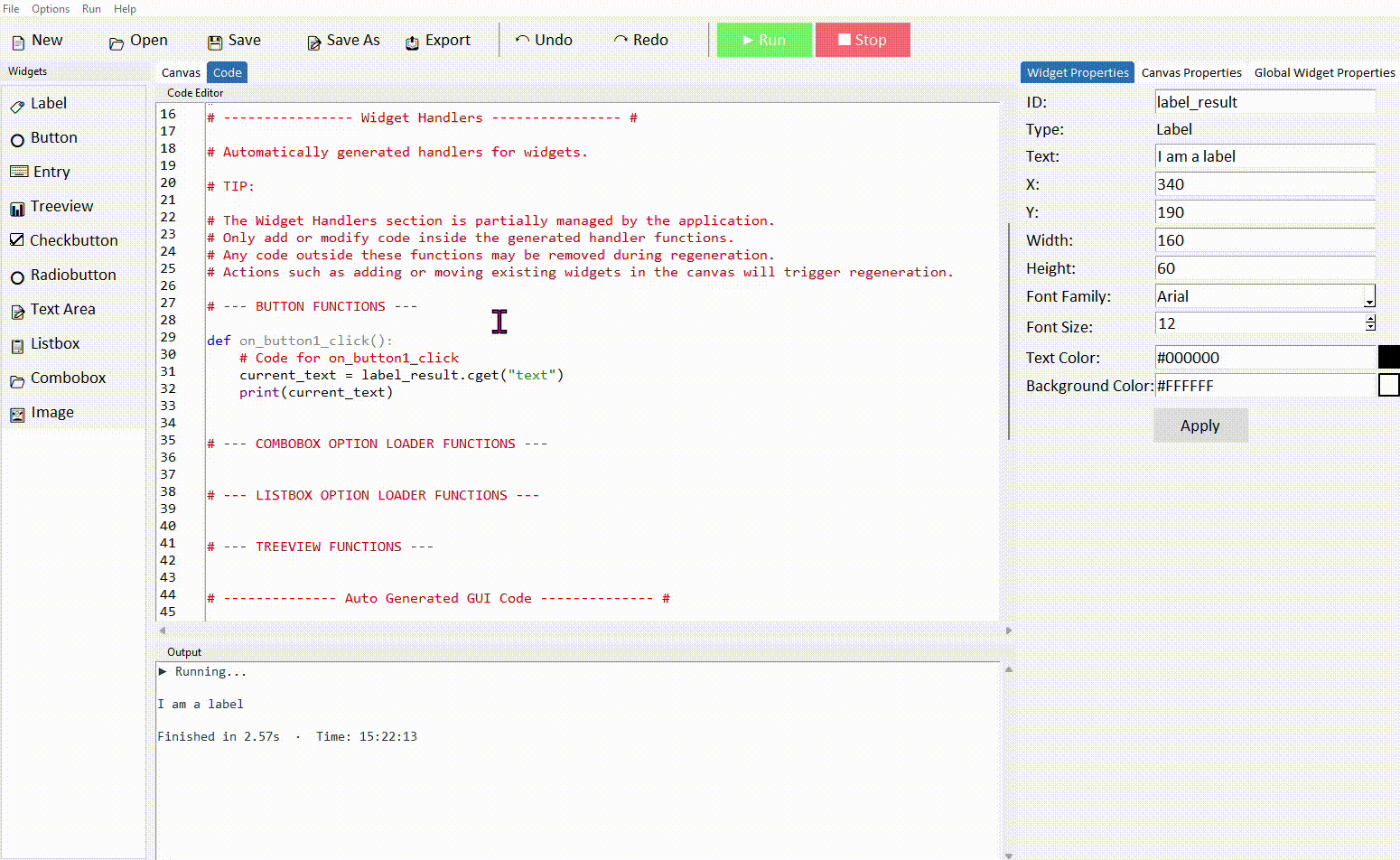
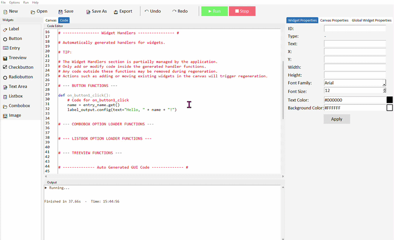
The Code Tab
At the top of the center panel you'll see two tabs — Canvas and Code. Clicking Code switches to the code editor, where you can see and edit the Python that DragTK has generated from your canvas layout.
This is where you add your own logic — what happens when a button is clicked, how to calculate a result, what to display to the user.
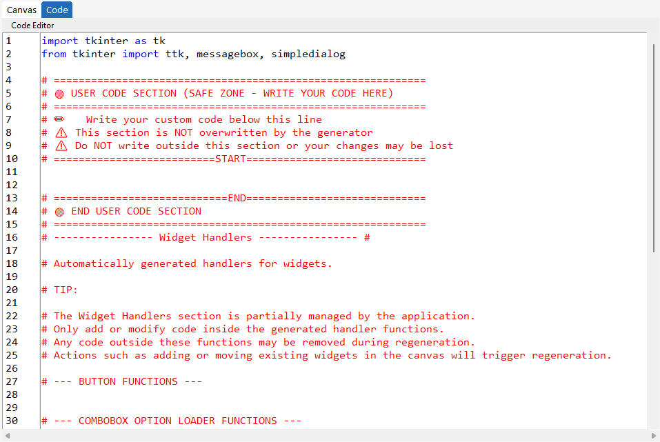
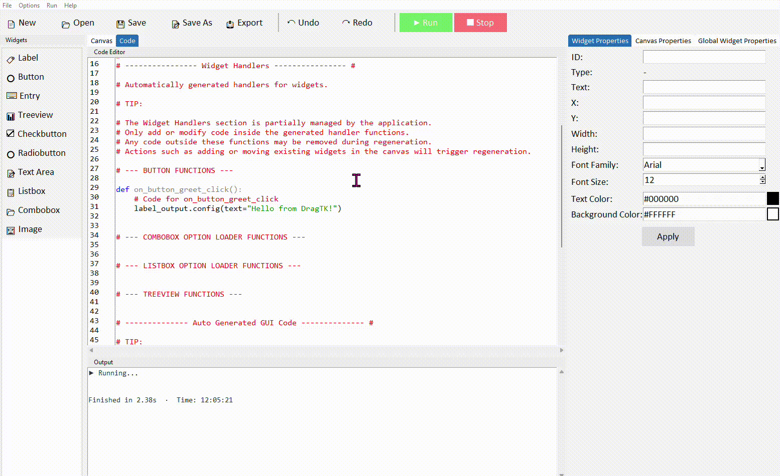
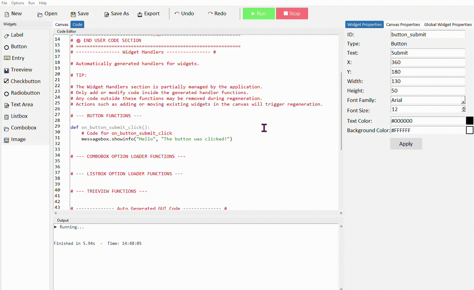
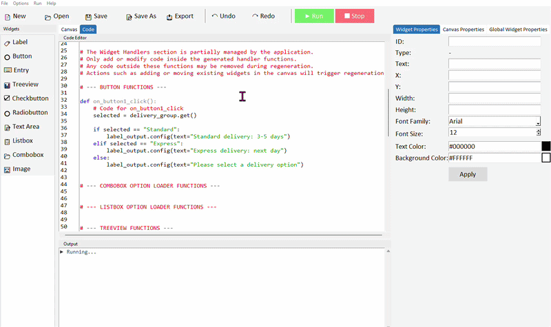
Important: Note the ===START=== and ===END=== marker section seen on lines 10 and 13 in the code tab image above. It is important that when you add any custom functions or code that it is placed between these markers. DragTK generates your codebase as you add and modify widgets in your project. This means some parts of the code are re-written when you perform actions in the canvas. You can safely add code between these markers and also inside the apps generated functions for buttons, comboboxes, listboxes, and treeviews which appear in the --- Widget Handlers --- section. But code written outside of these areas is at risk of being lost due to how generation takes place.
You can switch freely between Canvas and Code at any time. Changes you make in either view are kept — adding a widget in Canvas adds its code automatically, and code you write manually is preserved when you switch back so long as it is written in the designated sections.
Running your app
When you're ready to test, click the Run button in the toolbar. DragTK saves your project and launches it as a real Python application. Your app window will open and you can interact with it just as a user would.
If your app has a Python error, a message will appear describing the problem. Read it carefully — it usually tells you exactly which line the error is on and what went wrong.
Your First App
Build a simple working app in a few minutes — a button that shows a message when clicked. This walks through the complete DragTK workflow from an empty canvas to a running application.
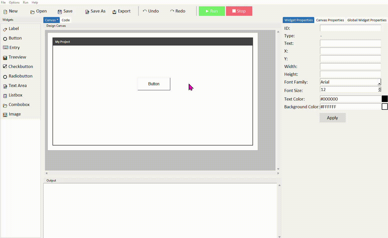
Step 1 — Add a button
Open DragTK. You'll start with an empty canvas. In the widget panel on the left, click Button. A button will appear on the canvas.
Drag the button to position it somewhere near the top of the canvas. Don't worry about being precise — you can always move it later.
Step 2 — Add a label
Now click Label in the widget panel. A label will appear on the canvas. Drag it below the button.
The label will display a message when the button is clicked. It starts with default text — that's fine for now, we'll update it with code.
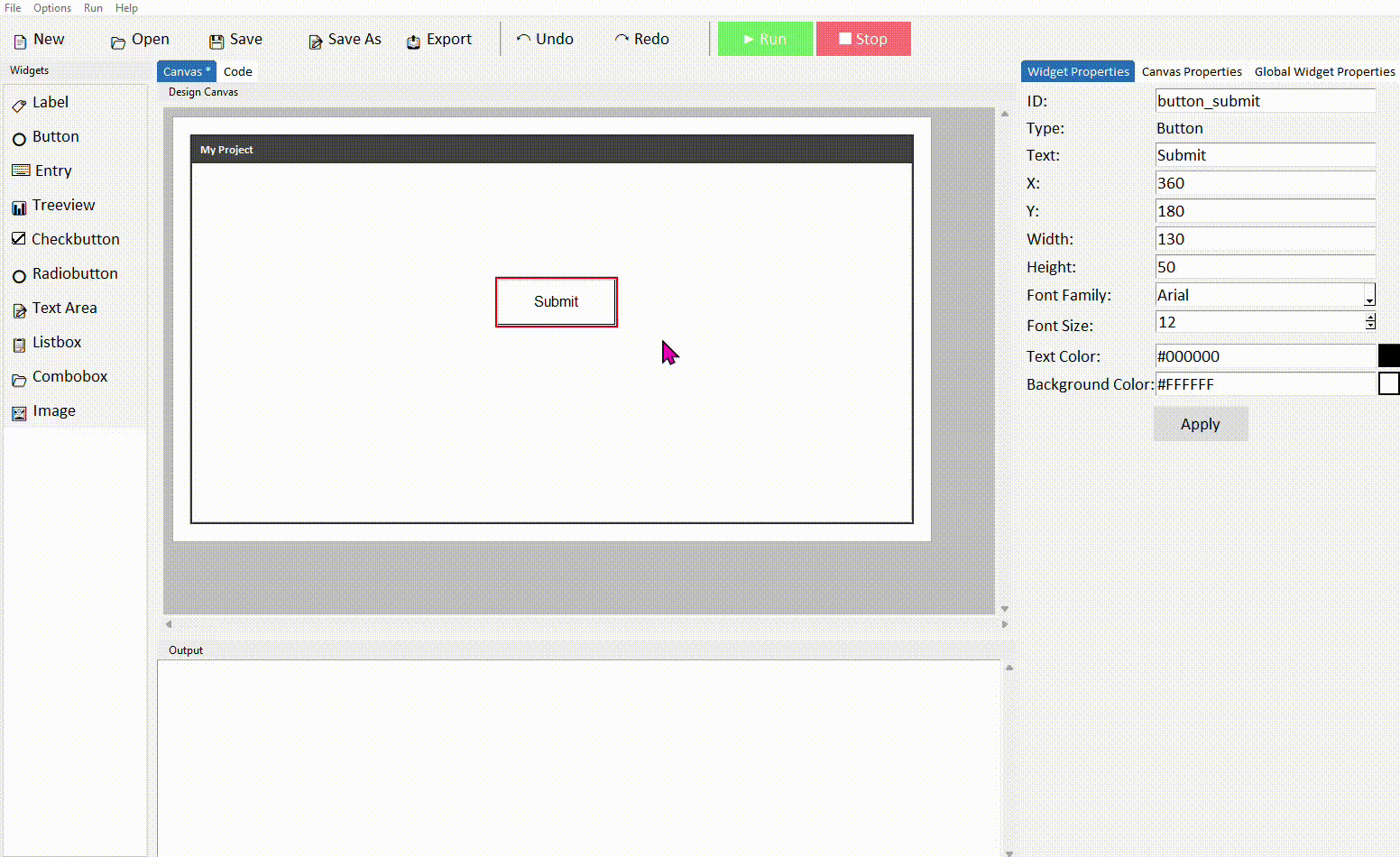
Step 3 — Name your widgets
Click on the button to select it. In the properties panel on the right, find the ID field and change it to button_greet. Click Apply.
Now click on the label and change its ID to label_output. Click Apply.
Step 4 — Write the button code
Click the Code tab at the top. Scroll down until you find the Buttons section — you'll see a function called on_button_greet_click with pass inside it.
Delete pass and replace it with this:
Make sure this line is indented — it must be inside the function. The editor will usually handle this automatically. If not, press Tab at the start of the line.
Step 5 — Run it
Click the Run button in the toolbar. You will be prompted to save the app first. Once saved, your app window will open. Click the button — the label should update to say Hello from DragTK!
That's it — you've built and run your first Python GUI app. From here, explore the widget lessons to learn what each component can do, or jump straight into one of the example projects.
Button
- ✓What a Button widget is and how it works
- ✓How to add and configure a Button in DragTK
- ✓Writing code that runs when the button is clicked
- ✓Enabling and disabling a button from code
- ✓A mini project — a colour-changing app
What is a Button?
A Button is a clickable control that triggers an action in your app. It's the primary way a user interacts with and controls what your application does. Every time you add a button in DragTK, a command function is automatically created in your code — anything you write inside that function runs when the user clicks the button.
Adding a Button in DragTK
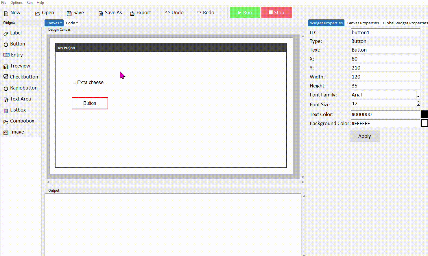
In the widget panel on the left, click Button. It will appear on the canvas with default text. Drag it into position.
Click the button to select it. In the Properties panel on the right, update the text to something descriptive like Submit or Calculate, and give it a meaningful ID — something like button_submit rather than the default button1. Click Apply.
Good button IDs describe what the button does, not what it looks like. button_calculate, button_clear, and button_submit are all clear — you'll thank yourself later when your code has several buttons and you need to tell them apart.
Writing code for a button click
Adding a button to the canvas also adds a function to your code. Here's how to find it and add your own logic.
Switch to the Code tab. Scroll down to the Buttons section. You'll find a function named after your button's ID — for example on_button_submit_click. Inside it is a single line: pass.
Delete pass and write your code in its place. As a starting point, try showing a messagebox:
Run the project and click the button. A messagebox should appear with your message.
The code inside a button command must be indented — it needs to sit inside the function. Python uses indentation to know which code belongs where. The editor handles this automatically, but if you're typing manually press Tab at the start of the line.
Enabling and disabling a button
Sometimes you want to prevent a button from being clicked until certain conditions are met — for example, not allowing a submit button to be clicked if the user hasn't filled in a field. You can control this with .config(state=).
A disabled button is greyed out automatically by Tkinter — you don't need to change its colour yourself. The user can see it's there but can't click it.
Common properties
These can be set in the Properties panel or updated at any time in code using .config().
| Property | What it does | Example value |
|---|---|---|
| text | The label shown on the button | "Submit" |
| font | Font family, size, and style | ("Arial", 12, "bold") |
| fg | Text colour | "white" |
| bg | Background colour | "#1a56db" |
| width | Width in characters | 15 |
| state | Enable or disable the button | "normal" or "disabled" |
| cursor | Mouse cursor when hovering | "hand2" |
Try it yourself
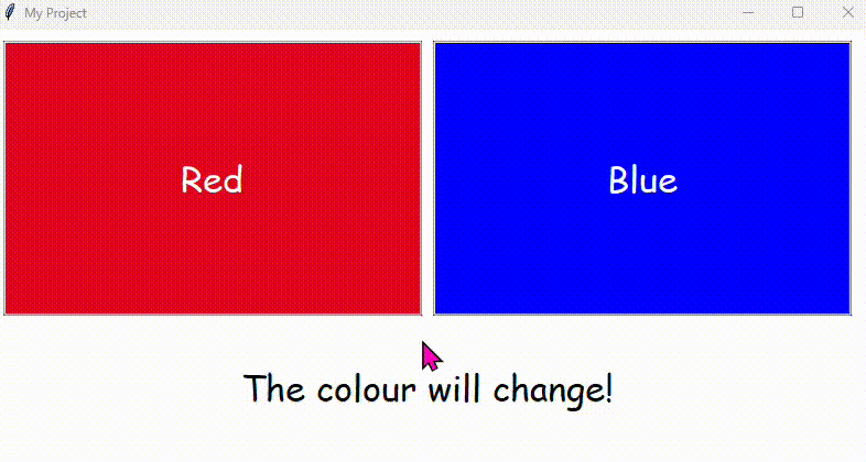
Build a colour-changing app
Create an app with a label and two buttons — one labelled Red and one labelled Blue. Clicking each button should change the label's text colour to match.
- Give your label the ID label_colour with some starting text
- In each button's command, use .config(fg=) on the label to change its colour
- Use colour names like "red" and "blue", or hex codes like "#cc0000"
- Example: label_colour.config(fg="red")
Extension: add a third Reset button that sets the label colour back to black.
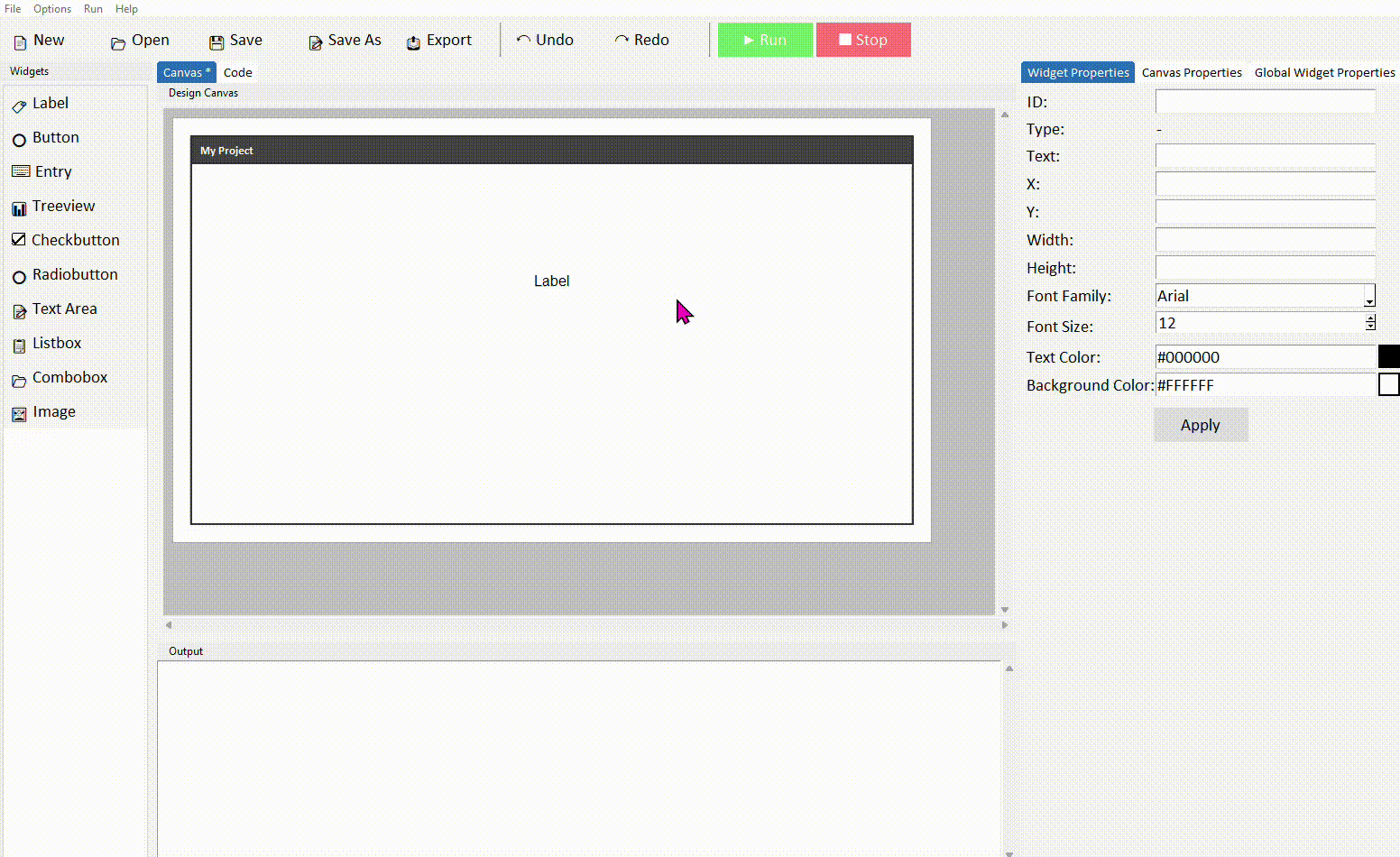
Label
- ✓What a Label widget is and when to use it
- ✓How to add and configure a Label in DragTK
- ✓Updating a label's text from code using .config()
- ✓Reading a label's current text using .cget()
- ✓A mini project — a click counter app
What is a Label?
A Label displays text in your app's window. It's one of the most commonly used widgets — useful for headings, instructions, status messages, and showing results back to the user. Unlike an Entry, the user can't type into it — it's purely for displaying information.
Labels are for displaying text, not collecting it. If you need the user to type something, use an Entry widget instead.
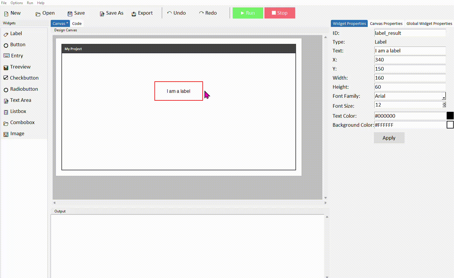
Adding a Label in DragTK
In the widget panel on the left, click Label. It will appear on the canvas with some default text. Drag it into position.
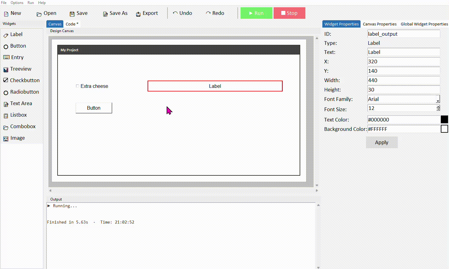
Click the label to select it. In the Properties panel on the right, update the text to whatever you want displayed, and give it a meaningful ID — something like label_result rather than the default label1. Click Apply.
You can also adjust the label's font, size, text colour (fg), and background colour (bg) from the properties panel. These let you style headings differently from body text without writing any extra code.
Updating a label's text from code
The most common thing you'll do with a label is update its text when something happens — a button is clicked, a calculation is done, a result is ready to show. You do this with .config().
Add a Label and a Button to your canvas. Give the label the ID label_result.
Switch to the Code tab and find your button's command function. Add the following inside it:
Run the project and click the button. The label should update with your message.
You can call .config() as many times as you like throughout your code — the label will update each time. This makes it useful for showing live status messages, scores, or results as the user interacts with your app.
Reading a label's current text
Sometimes you need to read what a label is currently displaying — for example, to check a value or use it in a calculation. Use .cget("text") to do this.
print(current_text)
A practical example — if your label is displaying a number (like a score), you can read it, convert it, add to it, and write it back:
new_score = current_score + 1
label_score.config(text=str(new_score))
.cget() always returns a string. If the label is showing a number you want to do maths with, wrap it in int() or float() first — as shown in the example above.
Common properties
These can be set in the Properties panel or updated at any time in code using .config().
| Property | What it does | Example value |
|---|---|---|
| text | The text displayed on the label | "Score: 0" |
| font | Font family, size, and style | ("Arial", 14, "bold") |
| fg | Text (foreground) colour | "red" or "#ff0000" |
| bg | Background colour | "white" or "#ffffff" |
| width | Width in characters | 20 |
| anchor | Text alignment within the label | "w", "center", "e" |
| wraplength | Wrap long text after this many pixels | 200 |
Try it yourself
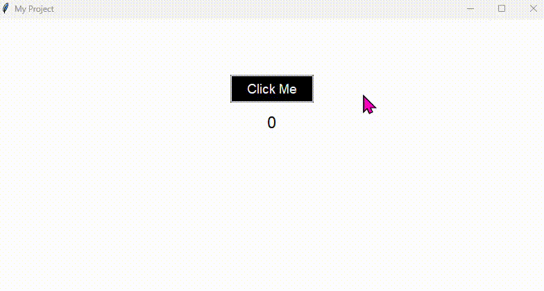
Build a click counter
Create an app with a label that starts at 0 and a button labelled Click me. Each time the button is clicked, the number on the label should increase by 1.
- Give your label the ID label_count and set its starting text to 0
- In the button command, read the current value with .cget("text")
- Convert it to an integer, add 1, then write it back with .config()
Extension: add a second button that resets the counter back to 0.
Entry
- ✓What an Entry widget is and when to use it
- ✓How to add and configure an Entry in DragTK
- ✓Reading what the user typed using .get()
- ✓Clearing an entry using .delete()
- ✓A mini project — a name greeter app
What is an Entry?
An Entry is a single-line text input field. It lets the user type something into your app — a name, a number, a search term — which your code can then read and act on. Think of it like a text box in any form you've filled in online.
Entry is for collecting input from the user. If you just want to display text, use a Label instead.
Adding an Entry in DragTK
In the widget panel on the left, click Entry. It will appear on the canvas. Drag it into position.
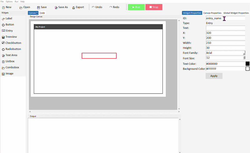
Click the entry to select it. In the Properties panel on the right, give it a meaningful ID — something like entry_name rather than the default entry1. Click Apply.
You can also adjust the entry's width, font, and text colour from the properties panel. The show property is useful for password fields — set it to * and typed characters will appear as asterisks.
Reading what the user typed
Once the user has typed something, you read it in your code using .get(). This is almost always done inside a button command — the user types something, then clicks a button to trigger the action.
Add an Entry, a Button, and a Label to your canvas. Give the entry the ID entry_name and the label the ID label_output.
Switch to the Code tab and find your button's command function. Add the following code inside it:
label_output.config(text="Hello, " + name + "!")
Run the project. Type a name into the entry and click the button — the label should update with your greeting.
.get() always returns a string. If you need a number — for example, the user has typed their age — you'll need to convert it: int(entry_age.get()) for a whole number, or float(entry_age.get()) for a decimal.
Clearing an entry
After reading the user's input it's good practice to clear the entry so it's ready for the next input. Use .delete() to do this.
Add this line after your .get() call so the field clears once the input has been read:
label_output.config(text="Hello, " + name + "!")
entry_name.delete(0, tk.END)
0 means "start from the beginning" and tk.END means "go to the end" — together they select and delete all the text in the entry.
Common properties
These can be set in the Properties panel or updated at any time in code using .config().
| Property | What it does | Example value |
|---|---|---|
| width | Width of the entry in characters | 30 |
| font | Font family and size | ("Arial", 12) |
| fg | Text colour | "#111111" |
| bg | Background colour | "white" |
| show | Masks typed characters (for passwords) | "*" |
| state | Enable or disable the entry | "normal" or "disabled" |
| justify | Text alignment inside the entry | "left", "center", "right" |
Try it yourself
Build a name card app
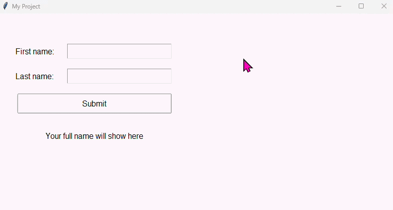
Create an app with two entry fields — one for a first name and one for a last name — plus a button and a label. When the button is clicked, the label should display the full name combined.
- Name your entries entry_firstname and entry_lastname
- Use .get() on both entries and join the strings together
- Update the label using .config()
- Clear both entries after the label updates
Hint: you can join two strings with first + " " + last.
Extension: add a Clear button that resets the label text and clears both entries.
Combobox
- ✓What a Combobox is and when to use it
- ✓How to add a Combobox in DragTK and set its options
- ✓Reading the user's selection using .get()
- ✓Setting a default selected value
- ✓A mini project — a meal order app
What is a Combobox?
A Combobox is a dropdown menu that lets the user pick one option from a predefined list. It takes up very little space on screen — showing only the currently selected value — and expands when clicked to reveal the full list of choices. You'll have used one in countless forms and settings menus.
Use a Combobox when you have a fixed list of options and want the user to choose exactly one. If you have only two or three choices, Radiobuttons may be clearer — but for longer lists a Combobox keeps the interface tidy.
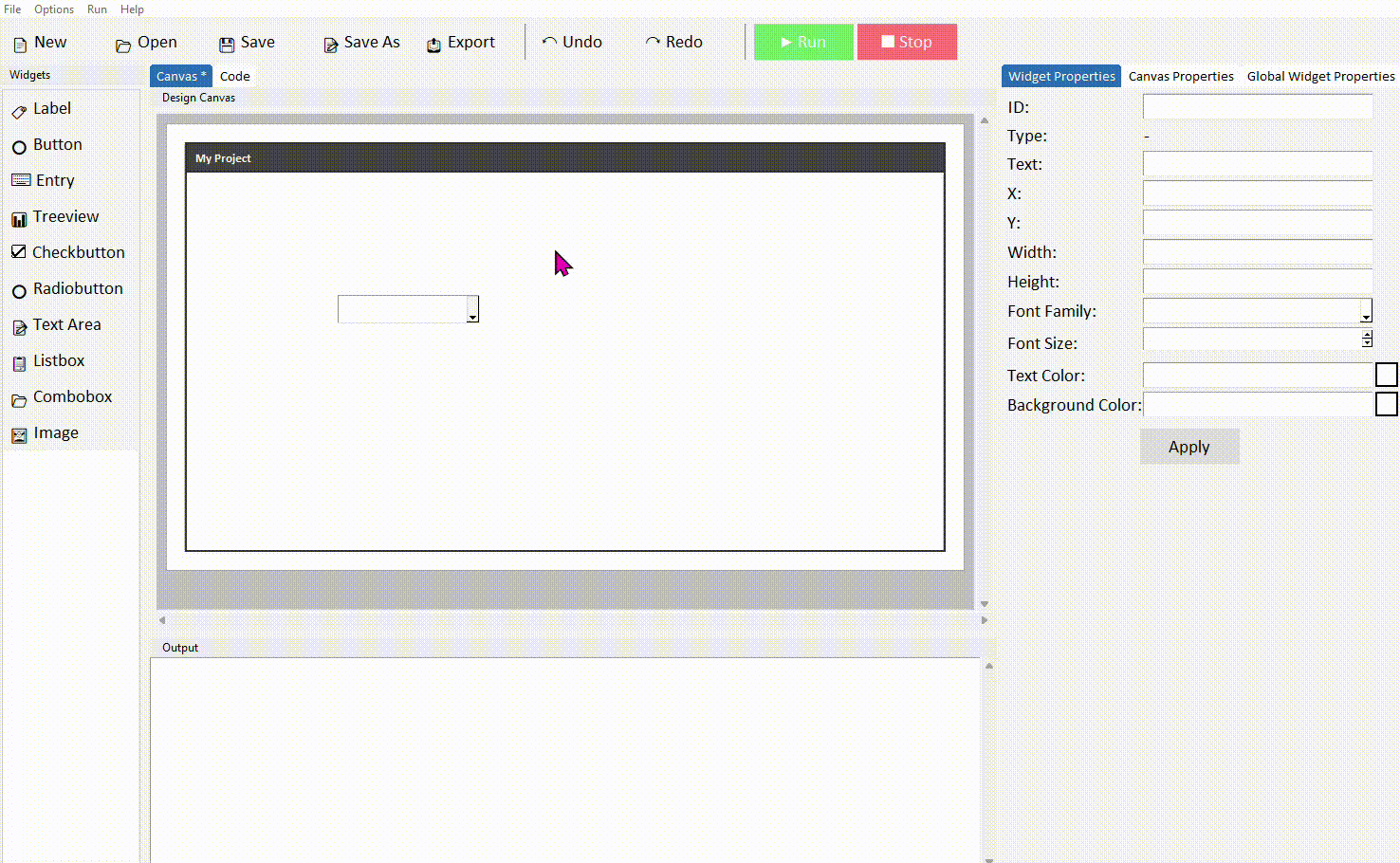
Adding a Combobox in DragTK
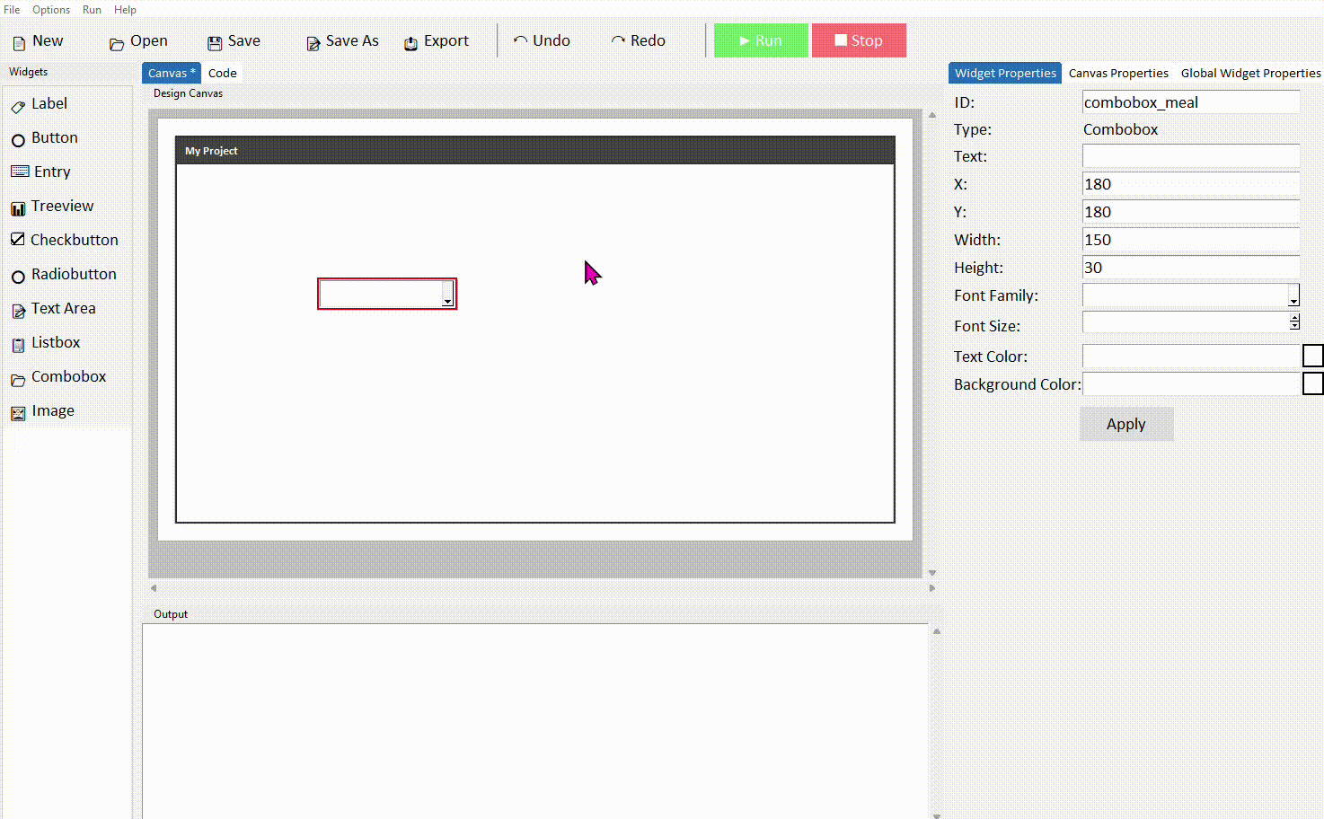
In the widget panel on the left, click Combobox. It will appear on the canvas showing a default selection. Drag it into position.

Click the combobox to select it. In the Properties panel on the right, give it a meaningful ID — something like combobox_meal rather than the default combobox1. Click Apply.
Setting the list of options
When DragTK adds a combobox to your canvas it automatically creates a function in the code that defines what items appear in the dropdown. Switch to the Code tab and scroll to the Combobox Option Loader Functions section — you'll find something like this:
# Return the list of options for combobox_meal
return ['Option 1', 'Option 2', 'Option 3']
Replace the placeholder strings with your actual options. Each item in the list is a string, separated by commas:
return ['Pizza', 'Pasta', 'Salad', 'Soup']
The function name is based on your combobox's ID. If you named it combobox_meal, the function will be called load_combobox_meal_options. If you rename the combobox ID later, remember to update the function name too.
Reading the user's selection
Just like an Entry, you read the currently selected value using .get(). This is typically done inside a button command — the user picks an option, then clicks a button to confirm.
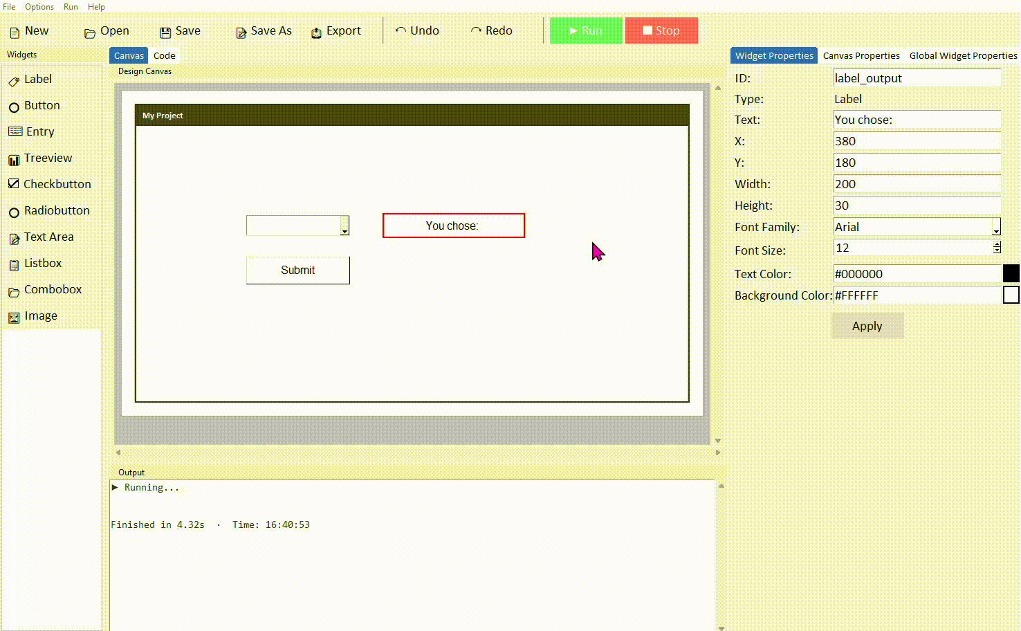
Add a Combobox, a Button, and a Label to your canvas. Set the combobox ID to combobox_meal and the label ID to label_output.

Update the option loader function with your list of choices, then find your button's command function and add the following:
label_output.config(text="You chose: " + selection)
Run the project. Click the combobox to open the dropdown, pick an option, then click the button — the label should show your selection.
If the user hasn't selected anything yet, .get() returns an empty string. It's good practice to check for this before using the value — for example: if selection == "": and then show a message asking the user to make a choice first.
Setting a default selected value
By default the combobox shows nothing until the user picks something. You can set a starting value so something is always selected when the app opens. If you want to initialise things like this in your app, use the on_load function found in the --- Widget Handlers --- section:
The value you pass to .set() should match one of the strings in your option loader function exactly — including capitalisation. If it doesn't match, the combobox will display the text but it won't correspond to a valid list item.
Common properties
These can be set in the Properties panel or updated at any time in code using .config().
| Property | What it does | Example value |
|---|---|---|
| width | Width of the combobox in characters | 20 |
| font | Font family and size | ("Arial", 12) |
| state | Controls whether the user can type freely or only pick from the list | "readonly" or "normal" |
| justify | Text alignment inside the combobox | "left", "center", "right" |
Setting state="readonly" prevents the user from typing their own value — they can only pick from your list. This is usually what you want, and DragTK sets this by default.
Try it yourself
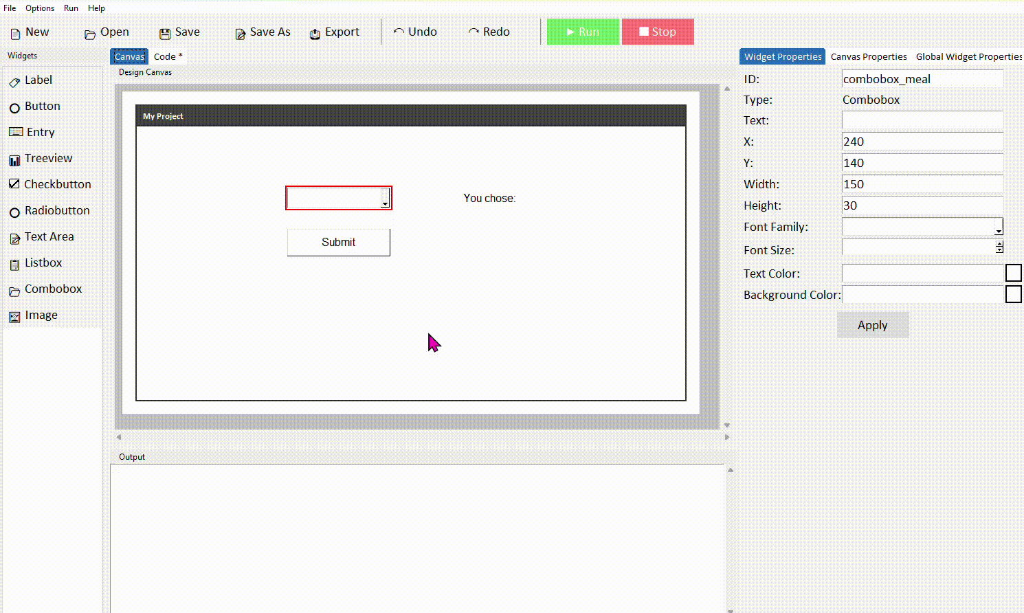
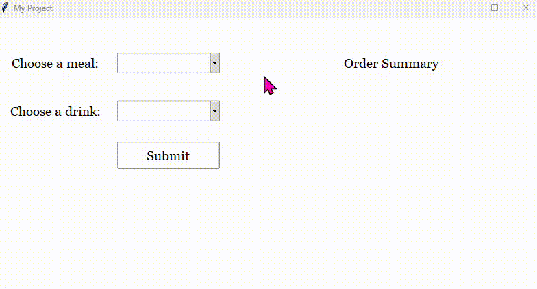
Build a meal order app
Create an app with two comboboxes — one for a main course and one for a drink — plus a button and a label. When the button is clicked, the label should display a summary of the order.
- Name your comboboxes combobox_main and combobox_drink
- Edit each option loader function to add realistic choices
- In the button command, read both selections with .get() and combine them into one output string
- Set a default value for each combobox using .set()
Extension: add a check that prevents the button from working if either combobox hasn't been selected — show a messagebox warning instead.
Checkbutton
- ✓What a Checkbutton is and when to use it
- ✓How to add a Checkbutton in DragTK
- ✓Understanding the auto-generated variable
- ✓Reading whether a checkbutton is ticked using .get()
- ✓Checking multiple checkbuttons together
- ✓A mini project — a toppings order app
What is a Checkbutton?
A Checkbutton is a tick box the user can toggle on or off. Unlike a Combobox or Radiobutton where only one option can be chosen, checkbuttons work independently — the user can tick as many or as few as they like. They're ideal for settings, preferences, and option lists where multiple selections are valid.
Use checkbuttons when the user can select more than one option at once — for example, pizza toppings or newsletter preferences. If only one option from a group can be selected at a time, use Radiobuttons instead.
Adding a Checkbutton in DragTK
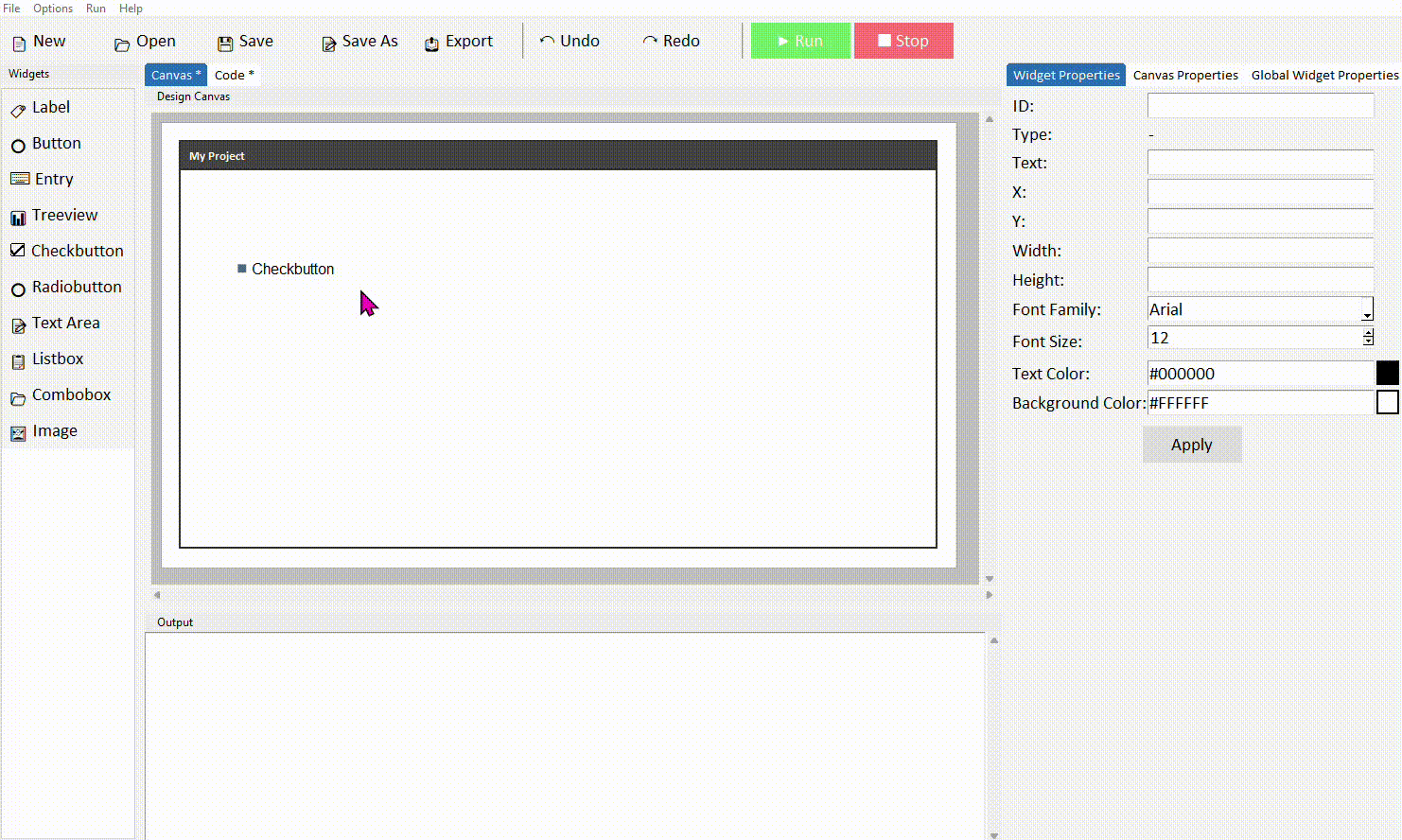
In the widget panel on the left, click Checkbutton. It will appear on the canvas with default label text. Drag it into position.
Click the checkbutton to select it. In the Properties panel on the right, update the text to describe the option — for example Extra cheese — and give it a meaningful ID such as checkbutton_cheese. Click Apply.
Understanding the auto-generated variable
When DragTK adds a checkbutton to your canvas, it automatically creates a BooleanVar — a special Tkinter variable that tracks whether the checkbutton is ticked or not. You'll see it referenced in the generated code like this:
text="Extra cheese",
variable=checkbutton_cheese_var,
onvalue=True,
offvalue=False,
style='checkbutton_cheese.TCheckbutton')
The variable is named after your checkbutton's ID with _var added to the end. So if your checkbutton ID is checkbutton_cheese, the variable tracking its state is checkbutton_cheese_var. This is the variable you'll use in your own code to find out whether the box is ticked.
A BooleanVar holds one of two values — True when the checkbutton is ticked, and False when it isn't. You don't need to create or set it yourself — DragTK handles that automatically.
Reading whether a checkbutton is ticked
To find out if a checkbutton is ticked, call .get() on its variable. This returns True if ticked and False if not — which you can use directly in an if statement.
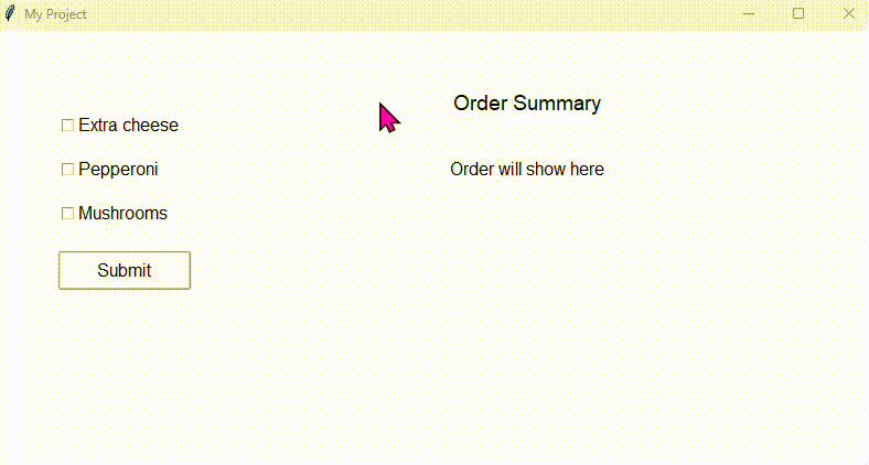
Add a Checkbutton, a Button, and a Label to your canvas. Name the checkbutton checkbutton_cheese and the label label_output.
Switch to the Code tab, find your button's command function, and add the following:
    label_output.config(text="Extra cheese: Yes")
else:
    label_output.config(text="Extra cheese: No")
Run the project. Tick the checkbutton and click the button — the label should reflect whether it's ticked or not.
Because .get() already returns True or False, you can shorten the condition to just if checkbutton_cheese_var.get(): — Python treats True as passing the check automatically.
Checking multiple checkbuttons
When you have several checkbuttons, check each one's variable in turn and build up your result. Here's an example with three toppings:
toppings = []

if checkbutton_cheese_var.get():
    toppings.append("Extra cheese")
if checkbutton_pepperoni_var.get():
    toppings.append("Pepperoni")
if checkbutton_mushrooms_var.get():
    toppings.append("Mushrooms")

if toppings:
    label_output.config(text="Toppings: " + ", ".join(toppings))
else:
    label_output.config(text="No toppings selected")
", ".join(toppings) is a neat Python trick that combines a list of strings into one, separated by commas — so ["Extra cheese", "Pepperoni"] becomes "Extra cheese, Pepperoni". Much cleaner than adding them together manually.
Common properties
These can be set in the Properties panel or updated in code using .config().
| Property | What it does | Example value |
|---|---|---|
| text | The label shown next to the tick box | "Extra cheese" |
| variable | The BooleanVar that tracks ticked state | checkbutton_cheese_var |
| onvalue | Value stored when ticked (default True) | True |
| offvalue | Value stored when unticked (default False) | False |
| state | Enable or disable the checkbutton | "normal" or "disabled" |
Try it yourself
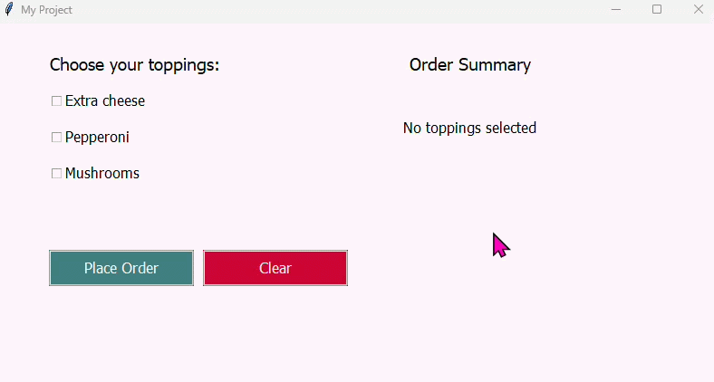
Build a pizza toppings order app
Create an app with three or more checkbuttons representing pizza toppings, a button labelled Place Order, and a label to display the result. When the button is clicked, the label should list every topping that has been ticked — or show a message if none were selected.
- Give each checkbutton a meaningful ID like checkbutton_cheese, checkbutton_pepperoni etc.
- Use a list to collect the selected toppings, checking each _var in turn
- Use ", ".join() to display them together in the label
- Handle the case where no toppings are ticked
Extension: add a Clear button that unticks all checkbuttons. You can do this by calling .set(False) on each variable — for example checkbutton_cheese_var.set(False).
Radiobutton
- ✓What a Radiobutton is and when to use it
- ✓How to add Radiobuttons and create a group in DragTK
- ✓Setting each button's value so they can be told apart
- ✓Reading the selected option using .get() on the group variable
- ✓A mini project — a delivery speed selector
What is a Radiobutton?
A Radiobutton is a circular selection control used in groups. Only one button in a group can be selected at a time — choosing one automatically deselects the others. They're ideal for situations where the user must pick exactly one option from a fixed set, such as a payment method, a difficulty level, or a delivery speed.
Use Radiobuttons when the user must pick exactly one option from a group. If the user can select multiple options at once, use Checkbuttons instead.
Adding Radiobuttons in DragTK
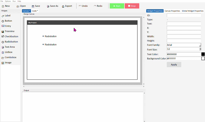
In the widget panel on the left, click Radiobutton. A small window will appear asking you to name a radio group or select an existing one from the dropdown. Type a descriptive group name — for example delivery_group — and confirm.
Add a second Radiobutton. This time, select your existing group from the dropdown rather than creating a new one. Both buttons are now linked — selecting one will deselect the other.
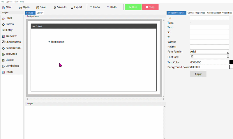
You can check which group a radiobutton belongs to by selecting it and looking at the Type property in the Widget Properties panel. To move a radiobutton to a different group later, right-click it on the canvas and select Group.
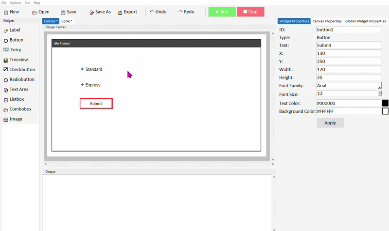
Setting each button's value
Each radiobutton belongs to a radiogroup, for example delivery_group. All radiobuttons in a group have a value. The selected radiobutton will determine the value stored in delivery_group when you later check what option a user has selected from the group.
In DragTK, whatever you set as the text property will also be the value of the radiobutton. In simple terms, make sure that each radiobutton you add to a group has unique text. By default, every new radiobutton has its text set to "Radiobutton". You must ensure each radiobutton has a unique value for its text or the radiobutton group will not function as expected.
The text property controls what the user sees next to the button. The value property is what gets stored in the group variable when that button is selected. It's good practice to keep them the same to avoid confusion, but they don't have to be.
Reading the selected option
To find out which radiobutton is currently selected, call .get() on the group variable. This returns the value of whichever button is selected — which is why setting unique values in the previous step matters.
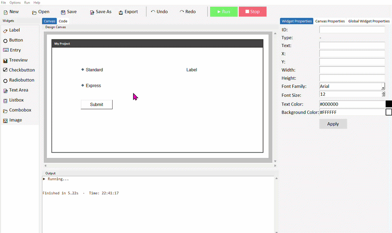
Add two or more Radiobuttons to the same group, a Button, and a Label. Set unique values for each radiobutton in the code, and give the label the ID label_output.
In your button's command function, read the group variable and respond to the result:
selected = delivery_group.get()

if selected == "Standard":
    label_output.config(text="Standard delivery: 3-5 days")
elif selected == "Express":
    label_output.config(text="Express delivery: next day")
else:
    label_output.config(text="Please select a delivery option")
Run the project. Select a radiobutton and click the button — the label should update based on your choice.
The else branch handles the case where nothing has been selected yet — .get() returns an empty string "" when no radiobutton in the group has been chosen. Always worth handling this to avoid your app behaving unexpectedly.
Setting a default selection
You can pre-select a radiobutton when the app opens by calling .set() on the group variable. Pass in the value of whichever button you want selected by default:
The value you pass to .set() must exactly match one of the value= strings in your radiobutton code. If it doesn't match, no button will appear selected.
Common properties
| Property | What it does | Example value |
|---|---|---|
| text | The label shown next to the button | "Standard" |
| variable | The StringVar shared across the group | delivery_group |
| value | The value stored when this button is selected | "Standard" |
| state | Enable or disable the button | "normal" or "disabled" |
Try it yourself
Build a delivery speed selector
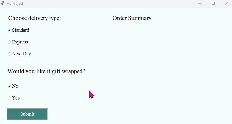
Create an app with three radiobuttons in one group — Standard, Express, and Next Day — plus a button and a label. When the button is clicked, the label should show the delivery option selected and its estimated time.
- Name your group something like delivery_group
- Set unique text properties for each radiobutton.
- Use delivery_group.get() and an if / elif / else chain to show the right message
- Set Standard as the default selection when the app opens
Extension: add a second group of radiobuttons for a gift wrap option — Yes or No — and include it in the output label.
Text Area
- ✓What a Text Area is and when to use it instead of Entry
- ✓How to add a Text Area in DragTK
- ✓Reading content using .get(1.0, tk.END)
- ✓Writing content using .insert()
- ✓Clearing a Text Area using .delete()
- ✓A mini project — a note-taking app
What is a Text Area?
A Text Area is a multi-line text input field. Unlike an Entry which is limited to a single line, a Text Area lets users type as much as they like across multiple lines — making it suitable for notes, messages, descriptions, or any input where a single line isn't enough.
Use a Text Area when you expect the user to type more than a short phrase — a note, a message, a paragraph. For single-line input like a name, age, or search term, an Entry is more appropriate.
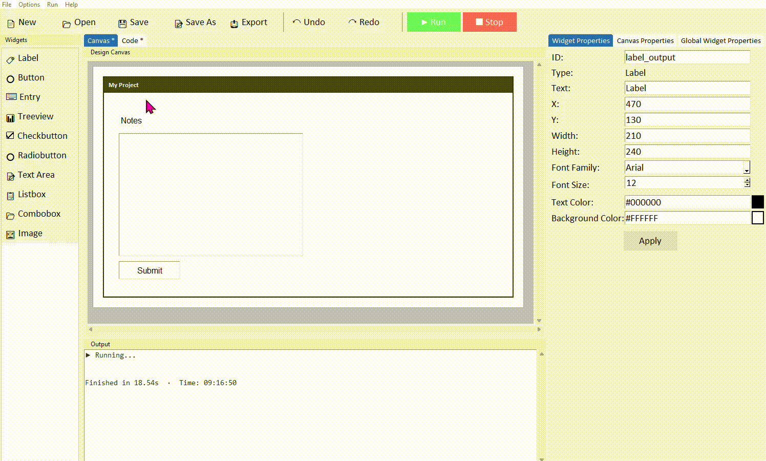
Adding a Text Area in DragTK
In the widget panel on the left, click Text Area. It will appear on the canvas as a resizable box. Drag it into position and resize it by dragging the edges to suit your layout.

Click the text area to select it. In the Properties panel on the right, give it a meaningful ID — something like textarea_notes rather than the default. Click Apply.
Reading content from a Text Area
Reading from a Text Area works differently to an Entry. Instead of just .get(), you need to pass two positions — where to start reading and where to stop. To read everything the user has typed, use .get(1.0, tk.END).
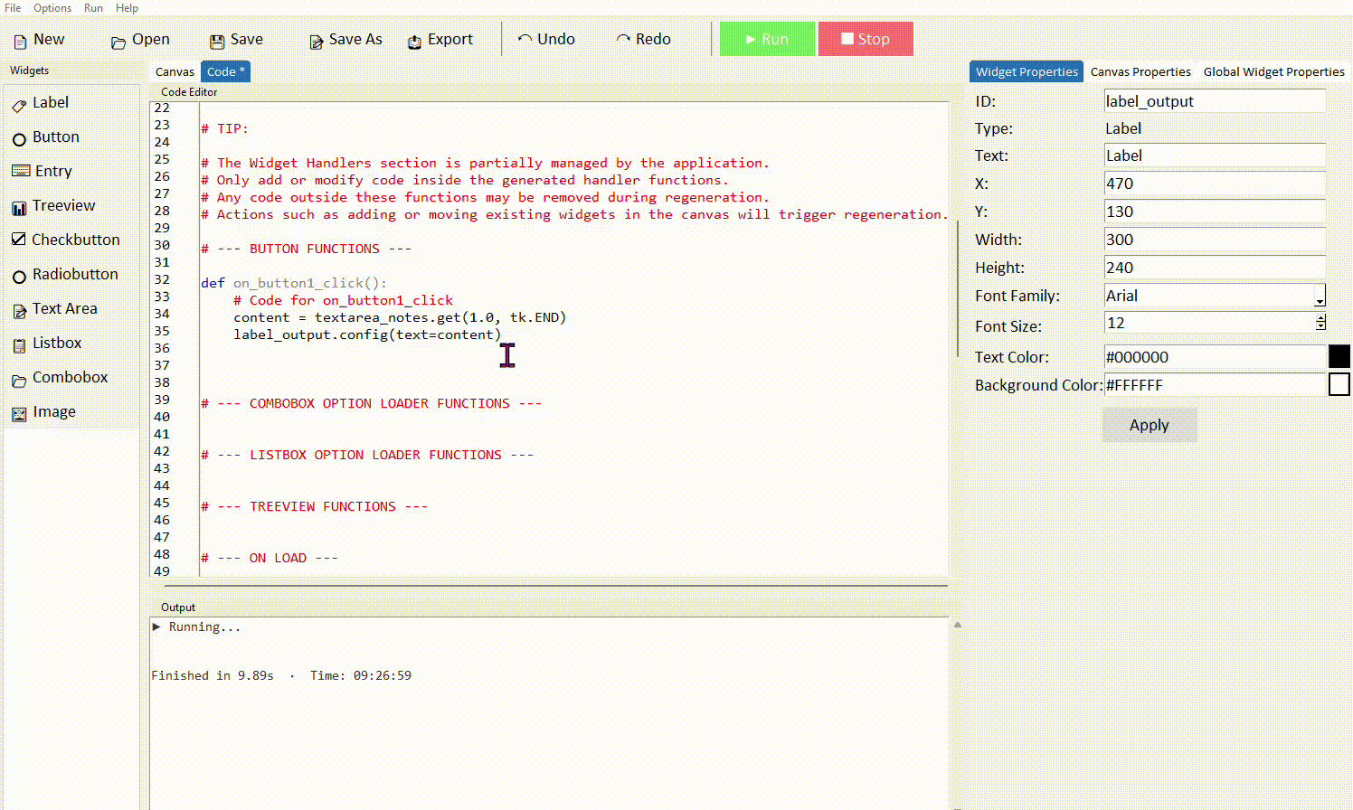
Add a Text Area, a Button, and a Label to your canvas. Give the text area the ID textarea_notes and the label the ID label_output.
In your button's command function, add the following code to read the text area content and display it in the label:
label_output.config(text=content)
Run the project. Type something into the text area and click the button — the label should display what you typed.
1.0 means line 1, character 0 — the very beginning of the text area. tk.END means the end of all content. Unlike Entry, Text Area uses this line/character position system throughout — you'll see the same pattern in .insert() and .delete() too.
.get(1.0, tk.END) always includes a trailing newline at the end of the string. If this causes issues — for example when comparing the content to another string — use .strip() to remove it: content = textarea_notes.get(1.0, tk.END).strip()
Writing content to a Text Area
You can insert text into a Text Area from your code using .insert(). This is useful for pre-filling the area with placeholder text, or displaying a longer result that wouldn't fit in a label.
To insert text at the end of whatever is already there, use tk.END as the position instead:
If you want to replace all the content rather than add to it, clear the text area first with .delete() (covered below) and then insert the new content.
Clearing a Text Area
To erase everything in a Text Area, use .delete() with the same start and end positions as .get():
A common pattern is to read the content, do something with it, then clear the area ready for the next input:
label_output.config(text=content)
textarea_notes.delete(1.0, tk.END)
Common properties
These can be set in the Properties panel or in code.
| Property | What it does | Example value |
|---|---|---|
| width | Width in characters | 40 |
| height | Height in lines | 10 |
| font | Font family and size | ("Arial", 12) |
| fg | Text colour | "#111111" |
| bg | Background colour | "white" |
| wrap | How long lines are handled | "word", "char", or "none" |
| state | Enable or make read-only | "normal" or "disabled" |
Setting wrap="word" means lines wrap at word boundaries rather than mid-word — this is almost always what you want for readable text input. state="disabled" makes the text area read-only, which is useful for displaying output the user shouldn't be able to edit.
Try it yourself
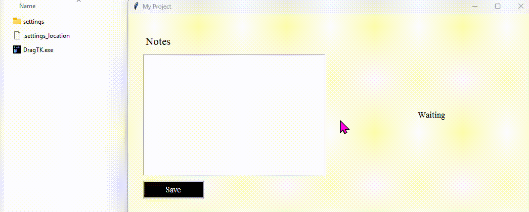
This challenge asks you to create an app which saves text to a file. The following example code reads from a textarea called textarea_notes, saves the content of it to a file called note.txt (which will save itself in the same folder as the DragTK app), and then update the label to state the file was saved and clear the textarea on screen.
file = open("note.txt", "w")
file.write(content)
file.close()
label_output.config(text="File saved!")
textarea_notes.delete(1.0, tk.END)
Build a note-taking app
Create an app with a Text Area for writing notes, a Save Note button, and a Label that confirms when the note has been saved.
- Give your text area the ID textarea_notes
- In the Save Note command, read the content with .get(1.0, tk.END).strip() and update the label to confirm it was saved
Extension: Check that the text area isn't empty before saving — if it is, show a warning label instead
Listbox
- ✓What a Listbox is and when to use it
- ✓How to add a Listbox in DragTK and set its starting items
- ✓Reading the selected item using .curselection() and .get()
- ✓Adding new items at runtime with a dialog
- ✓Deleting the selected item
- ✓A mini project — a shopping list app
What is a Listbox?
A Listbox displays a scrollable list of items the user can click to select. Unlike a Combobox which shows one item at a time in a dropdown, a Listbox shows multiple items at once and stays visible on screen. It's well suited to apps where the user needs to browse, select, add, or remove items from a collection — like a to-do list, a playlist, or an inventory.
Adding a Listbox in DragTK
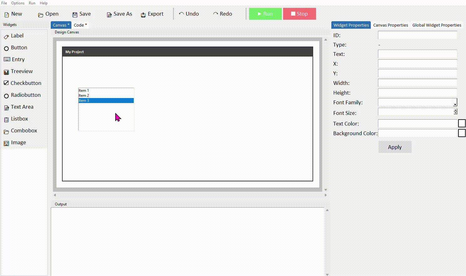
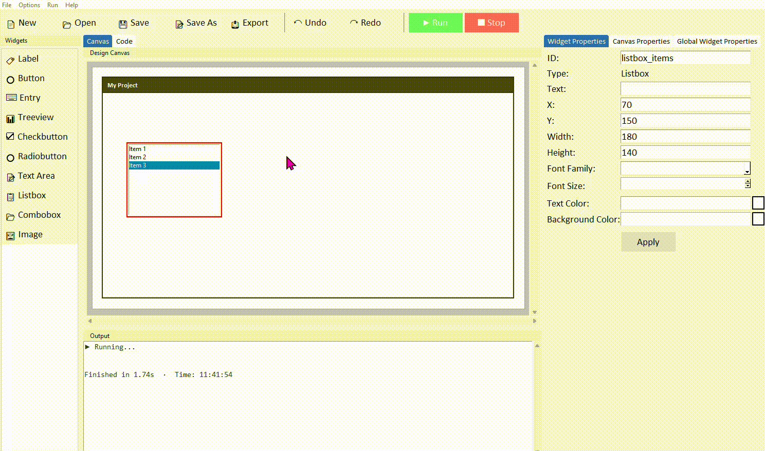
In the widget panel on the left, click Listbox. It will appear on the canvas showing placeholder items. Drag it into position and resize it to fit your layout.
While designing in DragTK, your listbox will always show placeholder items (Item 1, Item 2, Item 3) regardless of what you've set in the code. Your actual list items will only appear when you run the app.
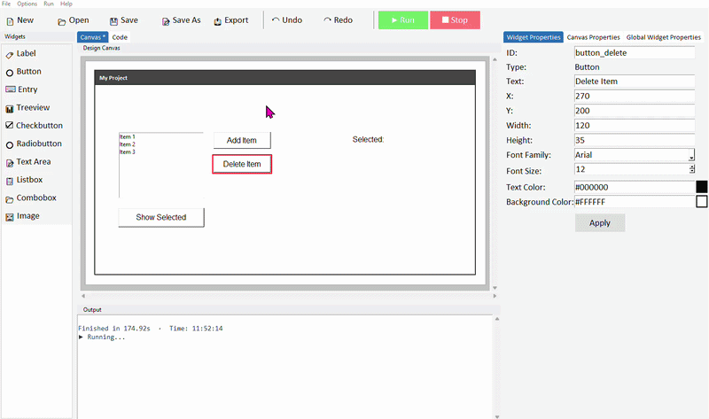
Click the listbox to select it. In the Properties panel on the right, give it a meaningful ID — such as listbox_items. Click Apply.
Setting the starting items
When DragTK adds a listbox, it generates an option loader function in your code that defines the default items shown when the app first opens. Switch to the Code tab and find it — it will look like this:
def load_listbox_items_options():
    # Return the list of items for listbox_items
    return ['Item 1', 'Item 2', 'Item 3']
Replace the placeholder strings with your own starting items:
def load_listbox_items_options():
    return ['Milk', 'Bread', 'Eggs']
This loader function only runs once when the app starts — it sets the initial contents of the listbox. Items added or removed while the app is running don't affect this function, and the function won't reset the list unless you call it again deliberately.
Reading the selected item
When the user clicks an item in the listbox, that item becomes selected. To read which item is selected you need two steps — first get the index of the selection, then use that index to get the text of the item.
Add a Listbox, a Button, and a Label to your canvas. Give the listbox the ID listbox_items and the label the ID label_output.
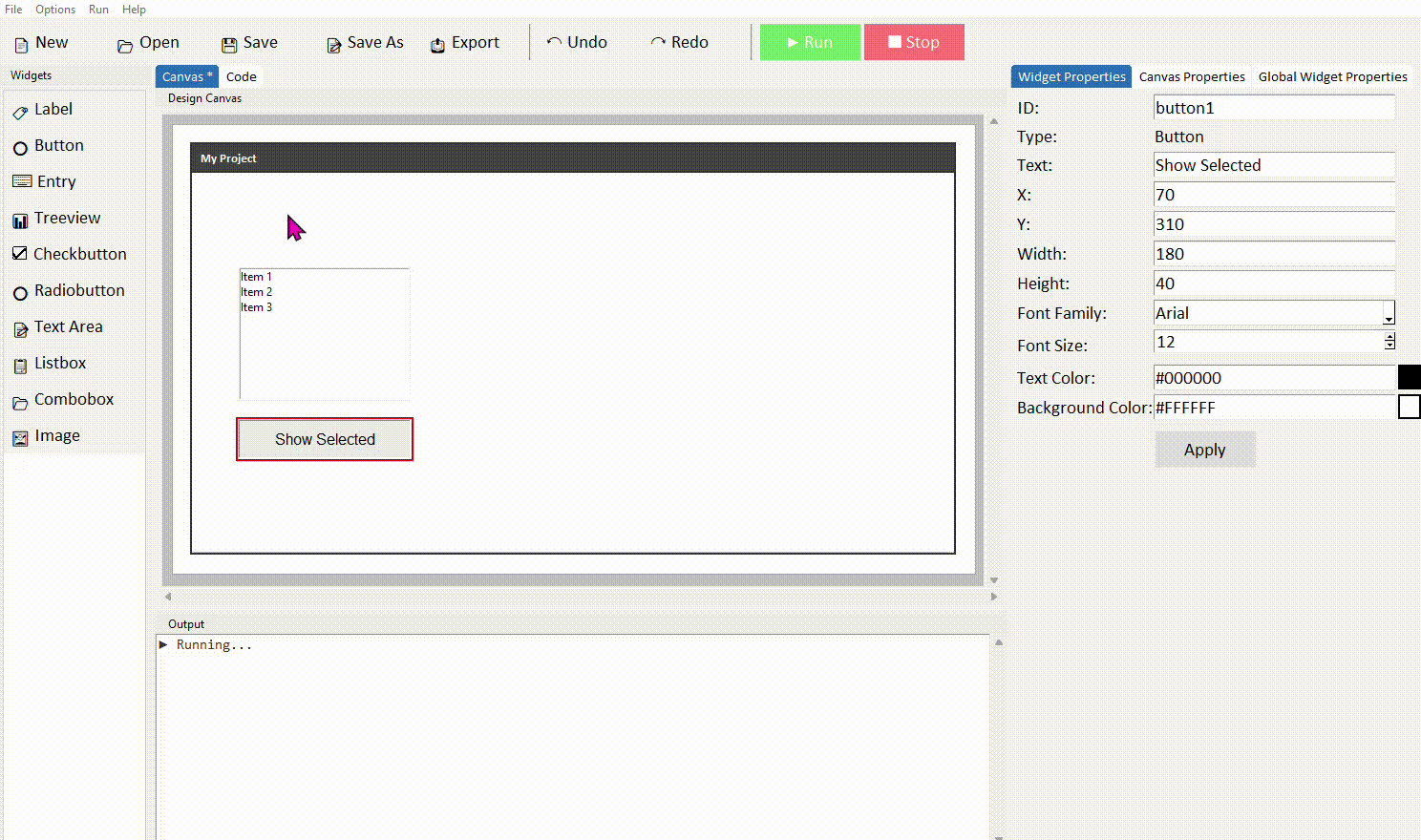
In your button's command function, add the following code:
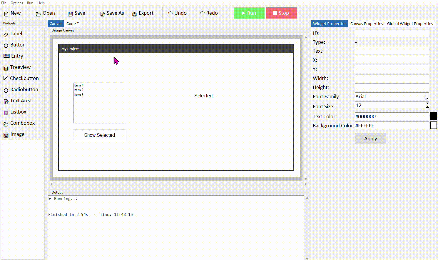
selection = listbox_items.curselection()

if selection:
    selected_item = listbox_items.get(selection[0])
    label_output.config(text="Selected: " + selected_item)
else:
    label_output.config(text="Nothing selected")
Run the project. Click an item in the list, then click the button — the label should show which item you selected.
.curselection() returns a tuple containing the index number of the selected item — for example (2,) if the third item is selected. We use selection[0] to get that index number, then pass it to .get() to retrieve the actual text. The if selection: check handles the case where nothing has been clicked yet — an empty tuple is treated as False.
Adding items at runtime
You can add new items to a listbox while the app is running using .insert(). A natural way to do this is to pop up a dialog asking the user what they want to add, then insert their response into the list.
new_item = simpledialog.askstring("Add Item", "Enter a new item:")

if new_item:
    listbox_items.insert(tk.END, new_item)
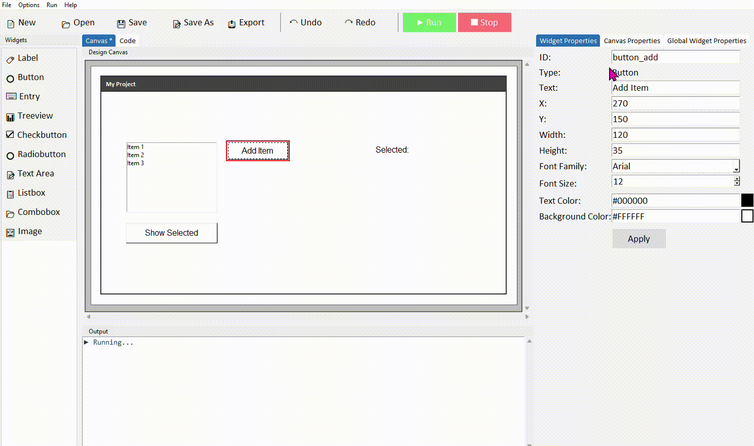
simpledialog.askstring() opens a small input box and returns whatever the user typed, or None if they cancelled. The if new_item: check makes sure nothing gets added if the user clicks Cancel or leaves it blank. tk.END inserts the new item at the bottom of the list.
Deleting the selected item
To remove an item, first check something is selected, then use .delete() with the selected index:
selection = listbox_items.curselection()

if selection:
    listbox_items.delete(selection[0])
else:
    messagebox.showwarning("Nothing selected", "Please select an item to delete.")
Always check that something is selected before calling .delete() — if curselection() returns an empty tuple and you try to use it as an index, your code will throw an error.
Common properties
| Property | What it does | Example value |
|---|---|---|
| width | Width in characters | 30 |
| height | Number of visible lines | 8 |
| font | Font family and size | ("Arial", 12) |
| fg | Text colour | "#111111" |
| bg | Background colour | "white" |
| selectmode | How many items can be selected | "single" (default) |
Try it yourself
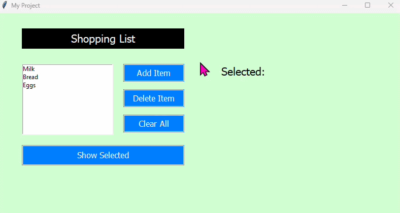
Build a shopping list app
Create an app with a Listbox pre-loaded with a few grocery items, an Add Item button, a Delete Item button, and a label that shows which item is currently selected.
- Edit the option loader function to add a few starting grocery items
- The Add Item button should use simpledialog.askstring() to get a new item and insert it at the end of the list
- The Delete Item button should remove the currently selected item, or show a warning if nothing is selected
- When the user clicks an item, a label should update to show what's selected — you can do this by binding to the listbox selection, or just reading it when a button is clicked
Extension: add a Clear All button that removes every item from the list. Hint: listbox_items.delete(0, tk.END) deletes everything at once.
Treeview
- ✓What a Treeview is and when to use it
- ✓How to add a Treeview in DragTK and set its columns and data
- ✓Reading the selected row
- ✓Loading data from a CSV file
- ✓Saving changes back to a CSV file
What is a Treeview?
A Treeview displays data in a table with rows and columns — similar to a spreadsheet. Each row represents a record and each column a field within it. It's well suited to apps that work with structured data, such as a student grade tracker, a product catalogue, or any list where each item has several pieces of information attached.
Treeview is one of the more powerful widgets in Tkinter but also one of the most useful. It's a step up in complexity from Listbox — use a Listbox for simple single-column lists, and a Treeview when each item has multiple fields.
Adding a Treeview in DragTK
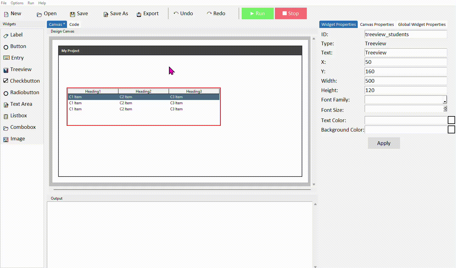
In the widget panel on the left, click Treeview. It will appear on the canvas showing sample column headings and placeholder rows. Drag it into position and resize to suit your layout.
Like the Listbox, the canvas always shows sample placeholder data. Your actual column headings and row data will only appear when you run the app.
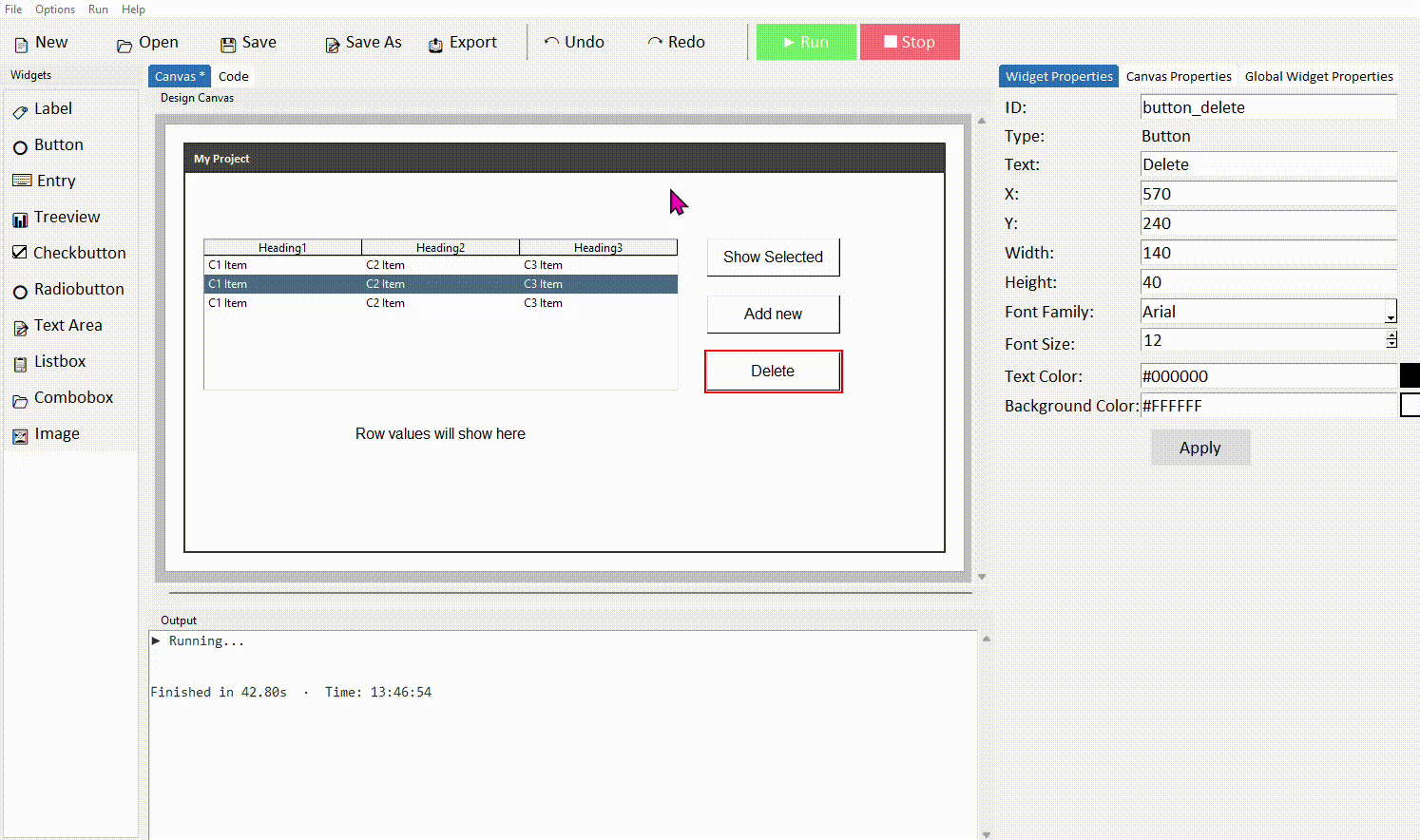
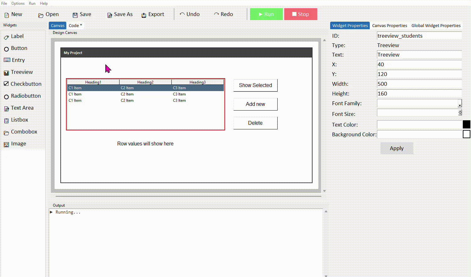
Click the treeview to select it. In the Properties panel on the right, give it a meaningful ID — such as treeview_students. Click Apply.
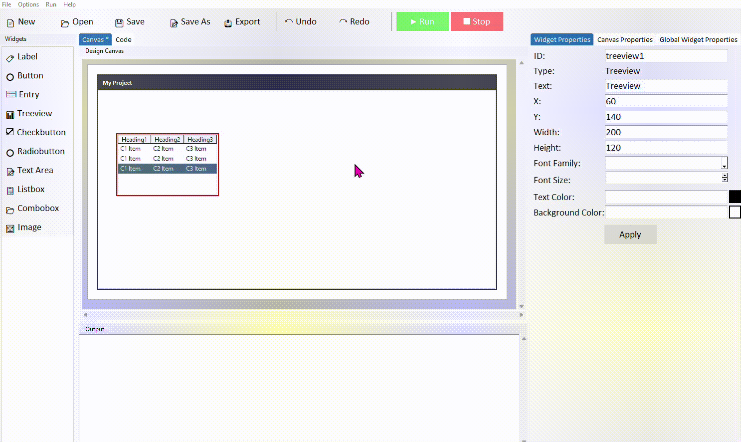
Setting columns and data
When DragTK adds a Treeview it generates a data function in the Treeview Functions section of your code. This function returns two things — a tuple of column headings and a list of row tuples. The rest of the generated code calls this function automatically to build the table when the app starts.
def get_treeview_students_data():
    headers = ("Heading1", "Heading2", "Heading3")
    sample_data = [
        ("C1 Item1", "C2 Item1", "C3 Item1"),
        ("C1 Item2", "C2 Item2", "C3 Item2"),
    ]
    return headers, sample_data
Update the headers tuple and sample data to match your own columns and starting values:
def get_treeview_students_data():
    headers = ("Name", "Subject", "Grade")
    sample_data = [
        ("Alice", "Maths", "A"),
        ("Bob", "Science", "B"),
        ("Charlie", "English", "A"),
    ]
    return headers, sample_data
Each row is a tuple — values in the same order as the headers. If your headers are ("Name", "Subject", "Grade") then each row tuple must have exactly three values in that same order.
Reading the selected row
When the user clicks a row, you can read its values using .selection() to get the selected item ID, then .item() to retrieve the values from it.
Add a Button and a Label alongside your Treeview. Give the label the ID label_output.
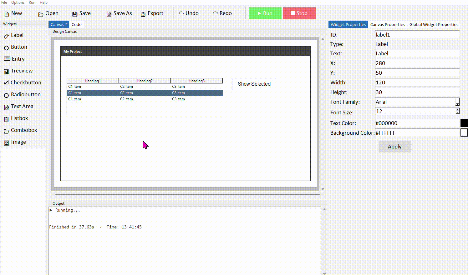
In your button's command function, add the following:
selected = treeview_students.selection()

if selected:
    row_values = treeview_students.item(selected[0], 'values')
    label_output.config(text="Selected: " + " | ".join(row_values))
else:
    label_output.config(text="No row selected")
Run the project. Click a row in the treeview and then click the button — the label should show the values from that row.
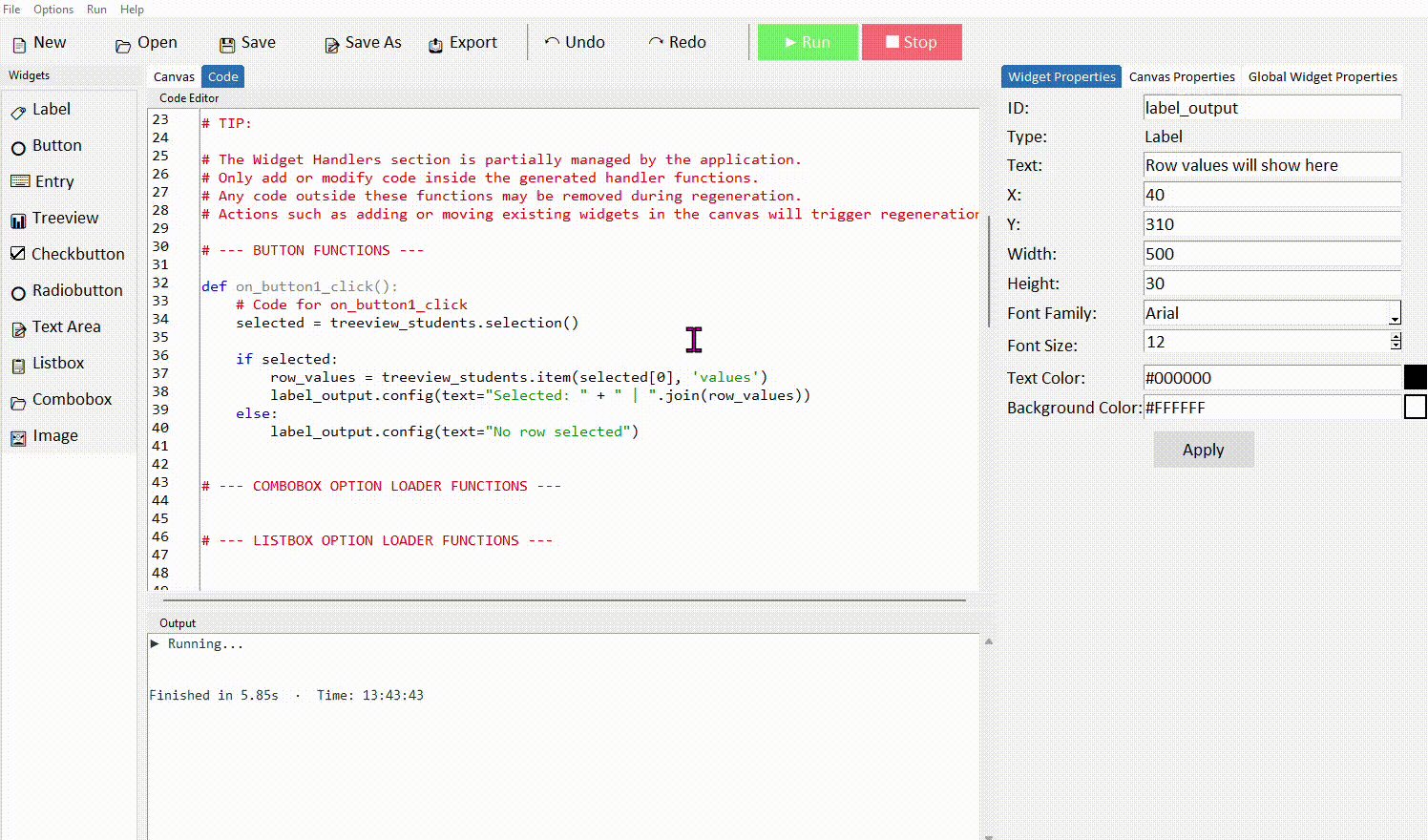
.selection() returns a tuple of selected item IDs — since we're using single selection, we use selected[0] to get the first (and only) one. .item(id, 'values') then returns the row's data as a tuple of strings. " | ".join(row_values) combines them into a readable single string.
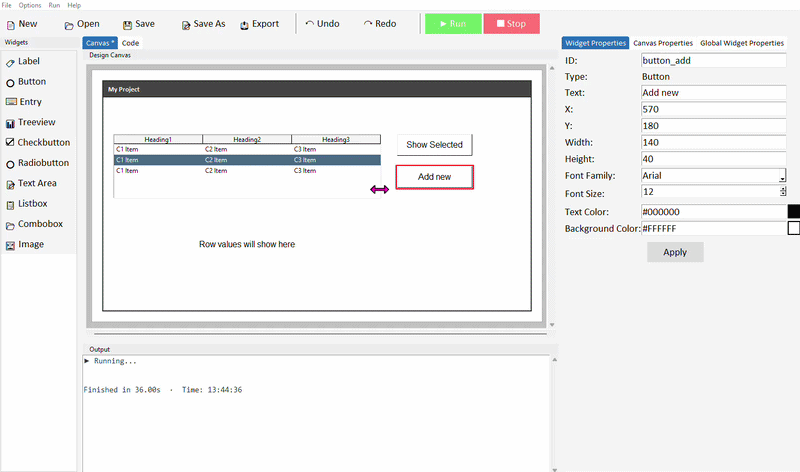
Adding a row to the Treeview
You can insert a new row into the treeview at runtime using .insert(). A clean way to do this is to collect the values using simpledialog.askstring() — one prompt per column — then insert them as a tuple.
Add an Add Row button to your canvas. In its command function, prompt the user for each column value and insert the result:
name = simpledialog.askstring("Add Row", "Enter name:")
subject = simpledialog.askstring("Add Row", "Enter subject:")
grade   = simpledialog.askstring("Add Row", "Enter grade:")

# Make sure the user did not leave name, subject, or grade blank before inserting
if name and subject and grade:
    treeview_students.insert('', tk.END, values=(name, subject, grade))
The if name and subject and grade: check ensures a row is only added if the user fills in all three prompts — if they cancel any one of the dialogs, askstring() returns None and the row won't be inserted. Adjust the number of prompts to match however many columns your treeview has.
Deleting the selected row
To remove a row, read the current selection and call .delete() with the selected item ID. This is similar to deleting from a Listbox, but instead of using an index number you pass the item ID directly.
selected = treeview_students.selection()

if selected:
    treeview_students.delete(selected[0])
else:
    messagebox.showwarning("Nothing selected", "Please select a row to delete.")
Unlike Listbox where .delete() takes an index number, the Treeview's .delete() takes the item ID returned directly by .selection() — so there's no need to use it as an index into .item() first. Pass selected[0] straight in and it works.
Deleting a row removes it from the treeview immediately, but it doesn't update your CSV file until you explicitly click Save. If the user closes the app without saving, the deletion will be lost.
Loading data from a CSV file
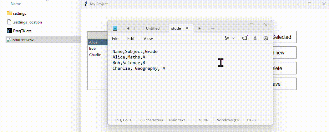
Rather than hardcoding data into the function, you can read it from a CSV file. This is useful when working with larger datasets, or when you want the data to come from a file that can be updated independently of the app.
A CSV file (Comma-Separated Values) is a plain text file where each line is a row and each value in that row is separated by a comma. The first line is usually the column headings. You can create one in any text editor or export one from Excel or Google Sheets.
Suppose you have a file called students.csv in the same folder as your project, containing:
Alice,Maths,A
Bob,Science,B
Charlie,English,A
Daisy,History,B
Ethan,Geography,C
Fiona,Physics,A
George,Chemistry,B
Hannah,Art,A
Isaac,Computer Science,A
Julia,Music,B
Replace your data function with this to read from the file instead:
def get_treeview_students_data():
    file = open("students.csv", "r")
    lines = file.readlines()
    file.close()

    headers = tuple(lines[0].strip().split(","))
    rows = []
    for line in lines[1:]:
        values = line.strip().split(",")
        if values:
            rows.append(tuple(values))

    return headers, rows
lines[0] is the first line — the headers. lines[1:] is every line after that — the data rows. .strip() removes any invisible newline characters at the end of each line before splitting by comma. The if values: check skips any blank lines at the end of the file.
The CSV file must be in the same folder as your project's .py file for this to work (or in next to your DragTK.exe file if the project is not yet exported). If the file isn't found, the app will throw an error when it starts.
Saving changes back to the CSV file
If the user adds or removes rows while the app is running, you can write the current treeview contents back to the CSV file so the changes are saved for next time the app opens.
First, add a Save button to your canvas. In its command function, loop through every row currently in the treeview, collect the values, and write them back to the file:
# Get the column headings
headers = treeview_students["columns"]

# Collect all rows currently in the treeview
rows = []
for item_id in treeview_students.get_children():
    values = treeview_students.item(item_id, 'values')
    rows.append(values)

# Write headers and rows back to the file
file = open("students.csv", "w")
file.write(",".join(headers) + "\n")
for row in rows:
    file.write(",".join(row) + "\n")
file.close()

messagebox.showinfo("Saved", "Data saved to students.csv")
.get_children() returns the IDs of every row currently in the treeview. Opening the file with "w" (write mode) overwrites the existing file completely — so the saved file always reflects exactly what's in the treeview at the time of saving.
Opening a file in "w" mode erases its existing contents immediately, before any new data is written. Make sure the treeview contains the data you want to keep before clicking Save — there is no undo.
Common properties
| Property | What it does | Example value |
|---|---|---|
| columns | Tuple of column identifiers — set automatically from the data function | ("Name", "Subject", "Grade") |
| show | Whether to show column headings | "headings" |
| height | Number of visible rows before scrolling | 8 |
| selectmode | How many rows can be selected at once | "browse" (single row) |
Try it yourself
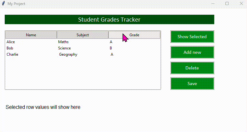
Build a student grade tracker
Create a CSV file called students.csv with three columns — Name, Subject, and Grade — and a few rows of data. Build an app that loads this data into a Treeview, lets the user see details of a selected row in a label, and saves any changes back to the file.
- Update the data function to read from students.csv using open()
- Add a View button that reads the selected row and displays the values in a label
- Add a Delete Row button that removes the selected row from the treeview using .delete(selected[0])
- Add a Save button that writes the current treeview contents back to students.csv
Extension: add an Add Row button that uses simpledialog.askstring() three times to collect Name, Subject, and Grade, then inserts a new row into the treeview with treeview_students.insert('', tk.END, values=(name, subject, grade)).
Image
- ✓What the Image widget is and how it works in DragTK
- ✓Adding an image and understanding the generated code
- ✓Supported file types and important limitations
- ✓What happens if the image file can't be found
- ✓Swapping an image at runtime from code
What is the Image widget?
The Image widget displays a picture file on your app's window. Under the hood it works as a Label with an image attached — which means it sits in a fixed position on the canvas just like any other widget, and can be repositioned and resized by dragging.
DragTK uses Tkinter's built-in PhotoImage to load images. Only .png and .gif files are supported — .jpg and other formats will not load. If you have a photo in another format, convert it to PNG first using any image editor or an online converter.
Adding an Image in DragTK
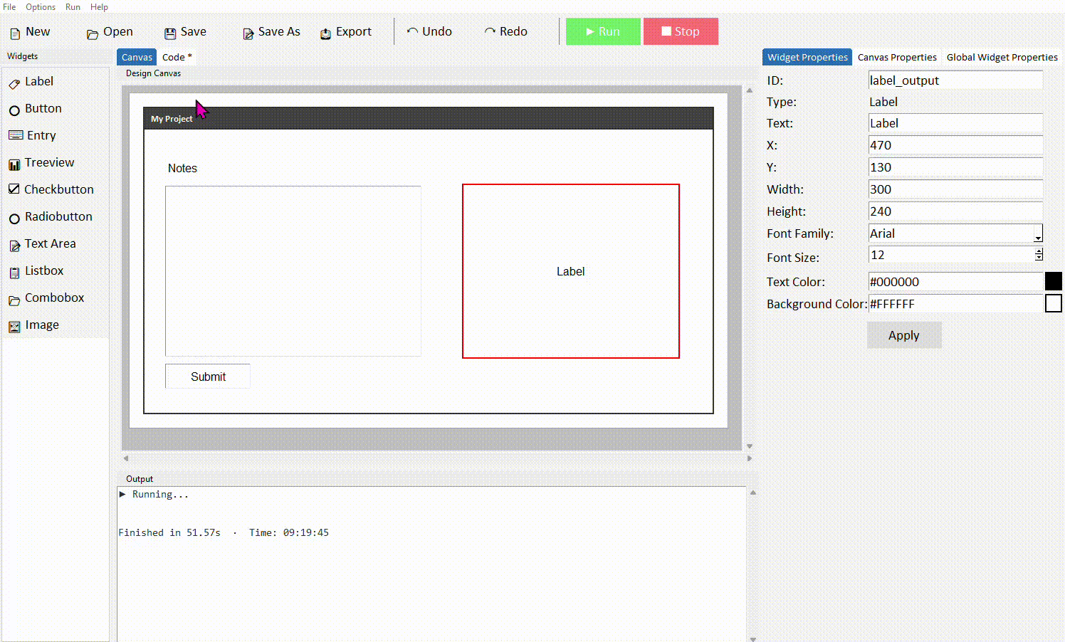
In the widget panel on the left, click Image. A file picker will open immediately — navigate to your image file, select it, and click Open. The image will appear on the canvas straight away.
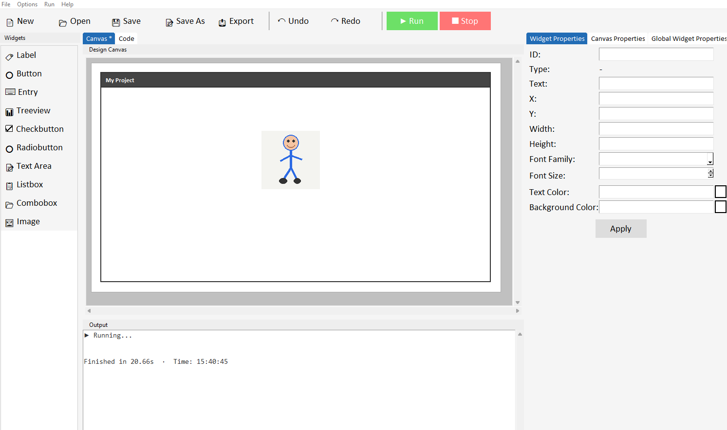
Give the image a good ID like my_image so you can reference it later in your code more easily. Drag the image to reposition it on the canvas. To resize it, drag from any edge or corner. DragTK will scale the image to fit the size you set.
Only .png and .gif files are supported. GIF animations will not play — only the first frame will be shown.
Understanding the generated code
When you add an image, DragTK generates code that loads the file from its location on your computer and displays it. Switch to the Code tab to see it — it will look something like this:
try:
    my_image_photo_orig = tk.PhotoImage(file="C:/Users/you/Pictures/logo.png")
    my_image_photo = my_image_photo_orig.subsample(
        max(1, my_image_photo_orig.width() // 150),
        max(1, my_image_photo_orig.height() // 100))
    my_image = tk.Label(root, image=my_image_photo)
except Exception as e:
    my_image = tk.Label(root, text="Image load failed.\n\nHas the image\npath changed?\n\nPath: C:/Users/you/Pictures/logo.png")
There are two important things to notice here:
1. The file path is absolute. The full location of the image on your computer is hardcoded into the generated code — for example C:/Users/you/Pictures/logo.png. This means the app knows exactly where to find the image when it runs.
2. The code is wrapped in a try/except. If the image file can't be loaded — for any reason — the app won't crash. Instead it shows a label with an error message explaining what went wrong.
The image file path — what can go wrong
Because the file path is stored as an absolute location, the image will only load correctly as long as the file stays in the same place. If you move, rename, or delete the image file, the app will show the error message instead of the image when it runs.
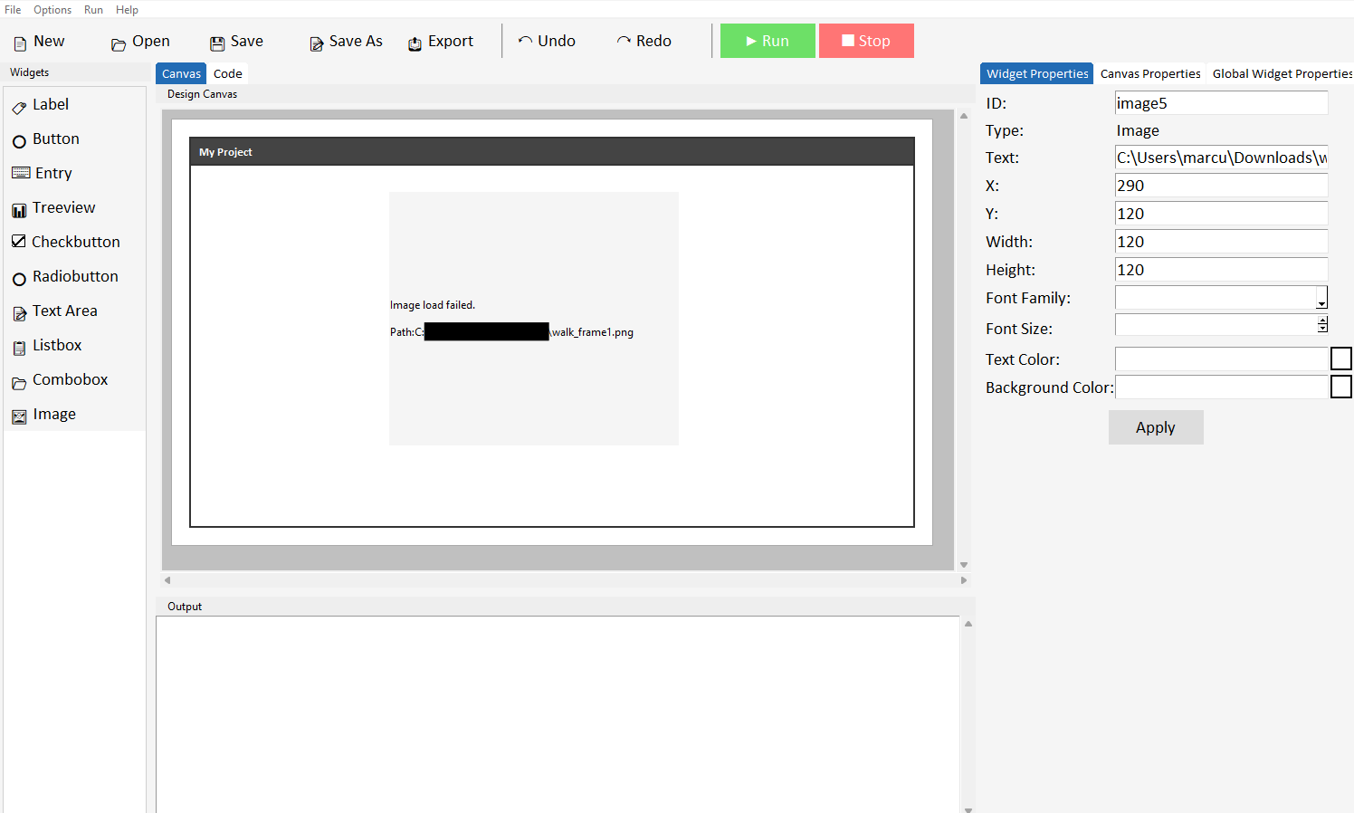
If you share your project with someone else — for example emailing the .py file to a classmate — the image path will point to a location that doesn't exist on their computer and the image won't load. Always share the image files alongside the project file, and be aware they may need to re-add the image in DragTK if the path has changed.
A good habit is to keep your image files in the same folder as your project and avoid moving them once added. This won't change the absolute path already in the code, but it keeps everything organised and makes it easier to spot if something has moved.
Swapping an image from code
Because the image widget is a Label under the hood, you can swap the displayed image at runtime from a button command — useful for things like showing different diagrams, cycling through pictures, or updating a logo based on a user's selection.
To swap the image, load a new PhotoImage and update the label using .config():
new_photo = tk.PhotoImage(file="C:/Users/you/Pictures/logo2.png")
my_image.config(image=new_photo)
my_image.image = new_photo
The line my_image.image = new_photo is essential and easy to forget. Python's garbage collector will delete the image from memory if nothing holds a reference to it — causing the image to disappear and show a blank widget. Storing it as an attribute of the label keeps it alive for as long as the label exists.
The same absolute path rule applies here — the path you pass to tk.PhotoImage(file=) must point to a real file that exists at that location. Only .png and .gif are supported.
Common properties
The image widget is a Label — so the same properties apply. The most relevant ones when working with images are:
| Property | What it does | Example value |
|---|---|---|
| image | The PhotoImage object to display | my_image_photo |
| bg | Background colour shown if image doesn't fill the widget | "white" |
| anchor | Where the image sits within the widget area | "center", "nw" |
| relief | Border style around the image | "flat", "solid" |
| borderwidth | Thickness of the border | 2 |
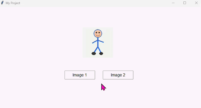
Try it yourself
Build a simple image viewer
Create an app with an Image widget and two buttons — Image 1 and Image 2. Clicking each button should swap the displayed image to the corresponding picture.
- Find two .png images and note their file paths
- Add an Image widget to the canvas using the first image
- Add two buttons — each one loads a different PhotoImage and updates the widget using .config(image=)
- Remember to store the new photo reference with my_image.image = new_photo after each swap
Extension: add a Label beneath the image that updates with the filename each time the image changes — use .config(text=) to show which image is currently displayed.
Messageboxes & Dialogs
- ✓How to store information in variables
- ✓How programs follow a sequence of steps
- ✓Showing information to the user with messageboxes
- ✓Collecting input using dialog boxes
- ✓Combining variables and strings using concatenation
About this project
In this project you will build a simple app with a single button. Step by step, the app will ask the user questions using dialog boxes, store their answers in variables, and then display a personalised message using a messagebox.
Along the way you'll learn two fundamental programming concepts — variables and sequence — that underpin almost every program ever written.
Variables are containers that store information. You give a variable a name and assign a value to it — for example name = "Alice". Your program can then use that value later by referring to the variable's name.
Sequence means that Python runs your code line by line, from top to bottom, in order. The order matters — you can't use a variable before you've created it, and steps happen one after another, not all at once.
Step 1 — Set up the canvas
Open DragTK and start a new project. Add a single Button to the canvas. Set its text to Start and give it the ID button_start. Click Apply.
This project only needs one button — all the interaction happens through messageboxes and dialogs that pop up when the button is clicked. Keep the canvas simple.
Step 2 — Show a welcome message
Switch to the Code tab and find the button_start_command function. Delete pass and add the following line:
messagebox.showinfo("Welcome", "Hello! Let's get to know each other.")
Run the project and click the button. A messagebox should appear with your welcome message. This is the first step in the sequence — the program greets the user before asking them anything.
messagebox.showinfo() takes two arguments — a title (shown in the window's title bar) and a message (the text in the body). The user clicks OK to dismiss it and the program moves on to the next line.
Step 3 — Ask for the user's name
Now add a dialog box that asks the user to type their name. The answer gets stored in a variable called name. Add this line below the messagebox line:
name = simpledialog.askstring("Your Name", "What is your name?")
Run the project and click the button. First the welcome message appears, then after you click OK the dialog box appears asking for a name. This is sequence in action — one step happens, completes, then the next begins.
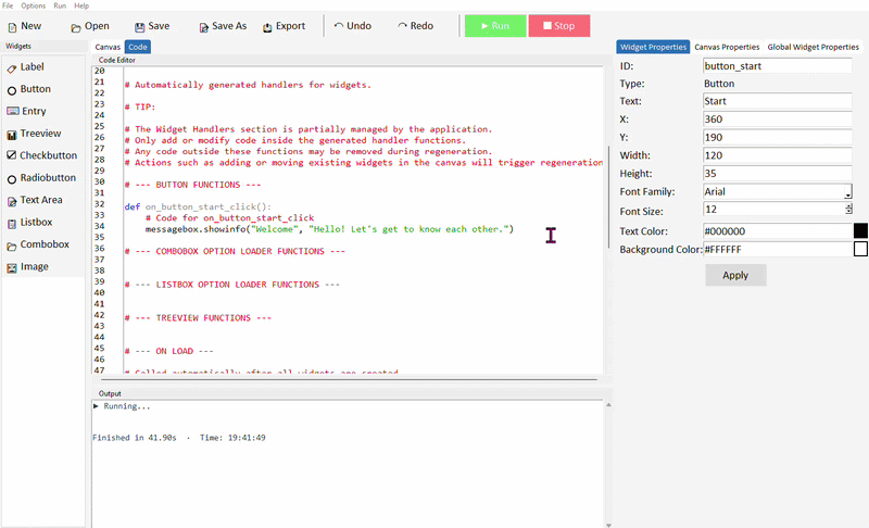
simpledialog.askstring() opens an input box and returns whatever the user typed. By writing name = at the start of the line, we store that returned value in a variable called name so we can use it later.
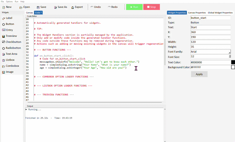
Step 4 — Ask for the user's age
Add a second dialog below the first to ask for the user's age. This time we use askinteger which only accepts whole numbers:
age = simpledialog.askinteger("Your Age", "How old are you?")
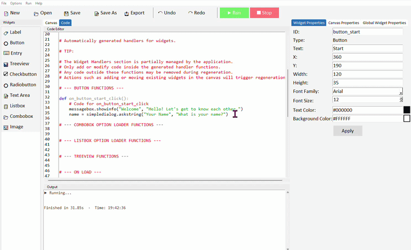
askinteger() works like askstring() but only accepts whole numbers — if the user types letters it will show a warning and ask again. The value stored in age will be an integer, not a string.
Step 5 — Use the variables in a message
Now add a final messagebox that uses both variables to display a personalised message. Add these lines below the age dialog:
message = "Nice to meet you, " + name + "!"
message += "\nYou are " + str(age) + " years old."
messagebox.showinfo("Hello!", message)
Notice str(age) — because age is an integer and we're joining it to a string, we need to convert it first using str(). Python won't let you join a number directly to a string without converting it.
"\n" inside a string creates a new line. So the message will display on two lines — the name greeting on the first line and the age on the second.
The complete button command
Here is the full sequence of code inside the button command — read through it line by line and think about what happens at each step:
def button_start_command():
    messagebox.showinfo("Welcome", "Hello! Let's get to know each other.")

    name = simpledialog.askstring("Your Name", "What is your name?")
    age = simpledialog.askinteger("Your Age", "How old are you?")

    message = "Nice to meet you, " + name + "!"
    message += "\nYou are " + str(age) + " years old."
    messagebox.showinfo("Hello!", message)
If the user clicks Cancel on either dialog, name or age will be None — and trying to join None to a string will cause an error. See the extension below for how to handle this.
Other messagebox and dialog types
There are several other messagebox and dialog types worth knowing about:
| Function | What it does | Returns |
|---|---|---|
| messagebox.showinfo() | Displays a message with an OK button | Nothing |
| messagebox.showwarning() | Displays a warning message | Nothing |
| messagebox.showerror() | Displays an error message | Nothing |
| messagebox.askyesno() | Asks a yes/no question | True or False |
| simpledialog.askstring() | Asks the user to type a string | A string or None |
| simpledialog.askinteger() | Asks the user to type a whole number | An integer or None |
| simpledialog.askfloat() | Asks the user to type a decimal number | A float or None |
Here is an example using askyesno() — notice it returns True or False which you can use directly in an if statement:
answer = messagebox.askyesno("Question", "Do you like Python?")

if answer:
    messagebox.showinfo("Great!", "Python is brilliant.")
else:
    messagebox.showinfo("Oh no!", "Give it time — it grows on you!")
Extension challenges
Make the app more robust and more interesting
- Handle Cancel: After each dialog, check if the variable is None before continuing — if it is, show a warning and stop. For example: if name is None: return
- Add a yes/no question: After collecting the name and age, use messagebox.askyesno() to ask a question — for example whether they enjoy coding — and adjust the final message based on their answer
- Ask a third question: Use askstring() to ask the user their favourite subject, and include it in the final message
- Calculate something: Use the age variable to calculate what year the user was born in and add it to the output — hint: you'll need to import or use a fixed current year value
The most important habit to build here is thinking about sequence — before writing any code, try writing out the steps in plain English first. What happens first? What needs to exist before the next step can run?
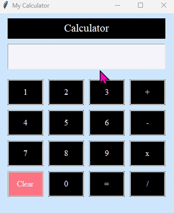
Calculator
- ✓How to design and lay out a UI with many buttons
- ✓Using buttons to build up a string in an Entry widget
- ✓Evaluating a mathematical expression using eval()
- ✓Handling errors gracefully with try / except
- ✓Clearing an Entry with .delete()
About this project
In this project you will build a working calculator app. The focus is on designing a clean UI with a grid of buttons and understanding how each button click builds up an expression in an Entry field — which is then evaluated and the result displayed when the user clicks equals.
This project is a great exercise in layout and repetition — you'll add a lot of buttons, and by the end you'll have a good feel for positioning widgets on a canvas.
Step 1 — Design the layout
Start a new project in DragTK. The finished calculator needs the following widgets — take a moment to plan where they'll sit before adding them:
| Widget | ID | Text / purpose |
|---|---|---|
| Label | label1 | "Calculator" — title at the top |
| Entry | entry_calculation | Displays the expression being built |
| Button ×10 | button0 – button9 | Digit buttons 0 through 9 |
| Button | button_plus | + |
| Button | button_subtract | - |
| Button | button_multiply | x |
| Button | button_divide | / |
| Button | button_equals | = |
| Button | button_clear | Clear |
Set your canvas size to around 350 × 400 pixels — this gives enough room for a 4-column button grid without the app feeling too large. Arrange the digit buttons in a 3×3 grid (7, 8, 9 on top, then 4, 5, 6, then 1, 2, 3) with 0, Clear, = and the operators in the bottom row and right column.
Step 2 — Program the digit buttons
Each digit button does one simple thing — it appends that digit to whatever is already in the entry field. Switch to the Code tab and add the following inside each digit button's command function.
Here is button 1 as an example — the pattern is identical for every other digit, just change the character being inserted:
def on_button1_click():
    entry_calculation.insert(tk.END, "1")

def on_button2_click():
    entry_calculation.insert(tk.END, "2")

def on_button3_click():
    entry_calculation.insert(tk.END, "3")
Repeat this for buttons 4 through 9 and button 0, inserting the matching digit string each time.
insert(tk.END, "1") adds the character "1" at the end of whatever is already in the entry. So pressing 1, then 2, then 3 builds up the string "123" one character at a time — exactly how a real calculator works.
Step 3 — Program the operator buttons
The operator buttons work in exactly the same way as the digit buttons — they just insert a different character. Add the following to each operator button's command:
def on_button_plus_click():
    entry_calculation.insert(tk.END, "+")

def on_button_subtract_click():
    entry_calculation.insert(tk.END, "-")

def on_button_multiply_click():
    entry_calculation.insert(tk.END, "*")

def on_button_divide_click():
    entry_calculation.insert(tk.END, "/")
The multiply button displays x as its text (more readable) but inserts * into the entry — because Python uses * for multiplication, not x. The text on the button and the character inserted don't have to match.
Step 4 — Program the Clear button
The Clear button wipes the entry completely so the user can start a new calculation:
def on_button_clear_click():
    entry_calculation.delete(0, tk.END)
Step 5 — Program the equals button
This is the most interesting button. When clicked it needs to read the expression from the entry, calculate the result, and display it. We use Python's built-in eval() function to do the maths:
def on_button_equals_click():
    try:
        result = eval(entry_calculation.get())
        entry_calculation.delete(0, tk.END)
        entry_calculation.insert(0, result)
    except:
        entry_calculation.delete(0, tk.END)
        entry_calculation.insert(0, "Error")
What is eval()? eval() takes a string and evaluates it as a Python expression. So eval("12+5") returns 17, and eval("10/4") returns 2.5. It understands the full order of operations — so eval("2+3*4") correctly returns 14, not 20.
What is try / except? Wrapping code in try: tells Python to attempt those lines. If anything goes wrong — for example the user has typed an invalid expression like 5++3 or tried to divide by zero — instead of crashing, Python jumps to the except: block. Here we clear the entry and show "Error" instead.
eval() is a convenient shortcut but it will execute any valid Python expression — not just maths. For a school project this is fine. In a real-world app you would validate the input more carefully before passing it to eval().
Step 6 — Run and test
Run the project and try the following to check everything works correctly:
| Test | Expected result |
|---|---|
| Press 1, 2, +, 8, = | 20 |
| Press 1, 0, /, 4, = | 2.5 |
| Press 2, +, +, 3, = | Error |
| Press 5, /, 0, = | Error (division by zero) |
| Press any digits then Clear | Entry empties |
The complete button functions
Here is all the code needed in the button functions section for reference:
def on_button1_click():
        entry_calculation.insert(tk.END, "1")

def on_button2_click():
    entry_calculation.insert(tk.END, "2")

def on_button3_click():
    entry_calculation.insert(tk.END, "3")

def on_button4_click():
    entry_calculation.insert(tk.END, "4")

def on_button5_click():
    entry_calculation.insert(tk.END, "5")

def on_button6_click():
    entry_calculation.insert(tk.END, "6")

def on_button7_click():
    entry_calculation.insert(tk.END, "7")

def on_button8_click():
    entry_calculation.insert(tk.END, "8")

def on_button9_click():
    entry_calculation.insert(tk.END, "9")

def on_button0_click():
    entry_calculation.insert(tk.END, "0")

def on_button_plus_click():
    entry_calculation.insert(tk.END, "+")

def on_button_subtract_click():
    entry_calculation.insert(tk.END, "-")

def on_button_multiply_click():
    entry_calculation.insert(tk.END, "*")

def on_button_divide_click():
    entry_calculation.insert(tk.END, "/")

def on_button_clear_click():
    entry_calculation.delete(0, tk.END)

def on_button_equals_click():
    try:
        result = eval(entry_calculation.get())
        entry_calculation.delete(0, tk.END)
        entry_calculation.insert(0, result)
    except:
        entry_calculation.delete(0, tk.END)
        entry_calculation.insert(0, "Error")
Extension challenges
Improve and extend your calculator
- Add a decimal point button — add a . button that inserts a decimal point, so the user can type values like 3.5
- Add a backspace button — a button that removes the last character typed. Hint: read the current entry value, slice off the last character with [:-1], clear the entry, and insert the shortened string back
- Style the buttons — give the operator buttons a different background colour to the digit buttons using the Properties panel to make the layout clearer to read
- Show the result in a Label instead — rather than replacing the entry content with the result, display it in a separate Label below the entry so the original expression stays visible
Build a To-Do List
Content coming soon. This project guides you through building a task manager using Entry, Listbox, and Button widgets.
Build a Quiz App
Content coming soon. Build a multiple-choice quiz app using Radiobuttons, Labels, and a score counter.
Build a Unit Converter
Content coming soon. Convert between units using Entry fields, Labels, and a dropdown menu.